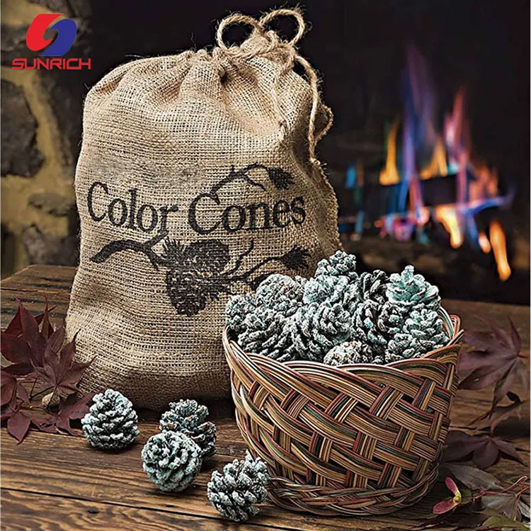

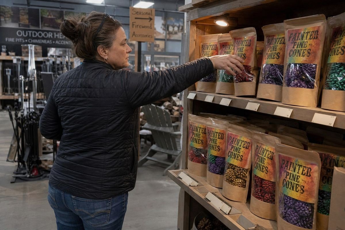
Clear-window packaging for colored pine cones can make or break a shelf sale. On our production line, we've watched vibrant cones fail at retail simply because buyers couldn't see them. That hurts sell-through, frustrates distributors, and wastes a beautiful product. The fix is a window design that sells the color instantly.
Clear-window packaging for colored pine cones works best with puncture-resistant PET or acetate windows, a kraft or dark paperboard frame for contrast, a window large enough to show full cone shapes, unprinted viewing areas, and compliant warning labels placed on side or back panels.
Below, I walk through materials, window geometry, branding, and compliance labeling. Each section gives you practical rules you can put straight into a [packaging brief for your supplier](https://sunrichfire.com/how-request-custom-inner-box-packaging-fireplace-colored-pine-cones-suppliers/).
What clear-window packaging materials keep my colored pine cones visible and protected during shipping?
During a container loading in Ningbo a few winters ago, we learned a hard lesson: thin film windows and sharp pine cone scales do not mix. Several display boxes arrived with scuffed, punctured windows.
The best window materials for colored pine cones are high-clarity PET film (at least 0.2mm gauge), rigid acetate window patches, or plant-based PLA film. Pair them with kraft paperboard or corrugated frames, and add anti-static and UV-resistant coatings to keep colors visible and protected.

Pine cones are not a soft product. Their woody scales are stiff and pointed, and painted or wax-coated cones add another risk: surface transfer. So your window material has to do three jobs at once. It must stay clear, resist puncture, and avoid pulling glitter or paint flakes onto its inner surface.
Matching the material to the risk
In our export shipments to the US and Germany, we test window films against real transit conditions. A cone shifting inside a box for four weeks at sea behaves very differently from one sitting on a photo table. Here is how the main options compare:
| Window Material | Clarity | Puncture Resistance | Eco Appeal | Best Use |
|---|---|---|---|---|
| PET film (0.2mm+) | Excellent | High | Recyclable | Stand-up pouches, box windows |
| Acetate window patches | Excellent | Medium-high | Biodegradable options exist | Premium gift boxes |
| PLA plant-based film | Very good | Medium | Strong (compostable) | Eco-positioned retail lines |
| Thin OPP film (under 0.1mm) | Good | Low | Recyclable | Not recommended for pine cones |
Gauge matters more than most buyers expect. A window that flexes inward will rub against wax-coated tips and dull the finish before the product ever reaches a shelf. We specify thicker film on any SKU with metallic paint or gold-tipped accents, because those finishes show scuffing first.
Two coatings are worth the small cost increase. First, an anti-static interior coating 1 stops loose glitter and dust from clinging to the window and clouding the view. Second, UV-resistant coatings 2 protect specialized dyes and metallic paints from fading under retail LED and fluorescent lighting. Colored flame cones often sit on shelves for a full season, so light exposure is real. Eco-friendly packaging materials like PLA windows and soy-based inks also help you win over the eco-conscious shoppers who buy botanical décor in the first place.
How do I choose window shapes and sizes that highlight the flame colors without weakening the box structure?
One trade-off we weigh on almost every OEM project: every square centimeter you cut away for visibility is a square centimeter of structural integrity you give up. The balance point is findable, but it takes discipline.
Choose a window covering 40–60% of the front panel, keep at least 20mm of paperboard margin on all edges, avoid cutting across corners or fold lines, and use a vertical rectangle or custom flame-shaped die-cut that reveals full cone silhouettes rather than partial views.

Pine cones have an irregular silhouette. A tiny circular porthole shows a random patch of scales and tells the shopper nothing. The window must reveal the whole cone shape, the color saturation, and ideally the count inside the pack. That is basic visual merchandising: the product itself is the proof, so let it be seen.
Rules we apply to die-cut window boxes
- Keep margins generous. Leave 20mm or more of solid paperboard between the window edge and any fold, glue flap, or corner. Cutting near a crease creates a tear line.
- Go vertical for premium sets. A tall window suits an upright cone arrangement and makes gift sets look fuller and more deliberate.
- Show the count. If you sell a six-pack, the window should make all six cones at least partially visible. Hidden product looks like missing product.
- Angle the product forward. A stadium-seating custom packaging insert tilts each cone toward the window, so the brightest painted faces always meet the shopper's eye.
- Echo the brand story. A flame-shaped or arched die-cut window reinforces the color-flame concept, though tooling costs rise slightly.
| Window Shape | Shelf Appeal | Structural Impact | Tooling Cost |
|---|---|---|---|
| Full-height vertical rectangle | High | Moderate (needs reinforced rails) | Low |
| Partial front rectangle | Medium | Low | Low |
| Custom flame or arch die-cut | Very high | Moderate | Medium |
| Wrap-around corner window | High | High (weakens corners) | Medium-high |
There is a bonus function here too. Clever geometric cutouts can double as ventilation ports. Painted or wax-coated cones can carry residual solvent or sap odors, and micro-perforations near the top of the box let those vent without fogging the window. Some of our fireplace-channel clients even use a scent-trap perforation zone deliberately, letting a light pine fragrance escape as sensory marketing.
Can I add custom branding and warning labels to clear-window packaging without blocking the product view?
A UK distributor once sent us artwork with the brand logo printed directly across the window film. We pushed back, and after one shelf test, they agreed: the cones sell the product, and the frame sells the brand.
Yes. Keep the window zone completely unprinted, place your logo and product name above the window, move usage instructions and warnings to side and back panels, and use a matte kraft or dark frame with accent colors matched to the cones' palette.

The core principle is simple: the window is for the product, and everything else is for the brand. In our private-label work, we treat the front panel like a picture frame. The frame should add contrast and identity, never compete with what is inside it.
The frame-and-focus method
A neutral or dark frame makes bright pigments pop. Kraft paper window boxes 3 work especially well for color-flame cones because the natural beige tone contrasts against saturated purples, reds, and metallic golds. A matte exterior finish also makes the glossy painted cones inside look brighter by comparison, since the eye reads the contrast in sheen as vibrancy.
Typography should stay minimal on the front. We recommend three elements maximum: brand name, product name, and one short benefit line such as the flame-color effect. Everything else, including burn instructions, pack counts by weight, and marketing copy, belongs on the back or side panels.
Warning labels deserve special handling. Fire products need clear cautionary text, but a warning slapped across the front panel kills shelf appeal. Our standard approach for OEM clients is a bordered warning block on the back panel plus a short signal phrase on one side panel. This keeps you compliant without visually crowding the window. Barcodes go on the base or back panel, never near the viewing area.
One more branding tool: color-blocking. A bold exterior color that contrasts with the internal product colors catches the eye from across the aisle, then the window closes the sale up close. We match accent inks to the cone palette so the whole package reads as one coordinated seasonal look, and we run these on soy-based inks for clients with eco positioning.
What compliance and safety labeling do I need on clear-window packaging for retail shelves in the US and Europe?
After 17 years exporting fire-themed products to 30+ countries, I can say this plainly: compliance is where retail deals live or die. Beautiful packaging with missing labels gets rejected at the buyer's warehouse.
US and EU retail packaging for color-flame pine cones needs fire-hazard warning text, usage and disposal instructions, country of origin, importer or distributor details, net contents, a scannable barcode, and for Europe, CE-relevant markings and language localization for each target market.

Colored pine cones for fireplaces and campfires are consumer fire products 4. That means the packaging must inform, warn, and identify, and it must do all three in a way retail sourcing teams can verify at a glance. Since we hold ISO 9001, BSCI, and CE certifications with SGS and Intertek test reports, our clients' compliance checklists have shaped how we design label zones on every window box and pouch we produce.
Core labeling checklist by market
| Label Element | US Retail | EU Retail | Recommended Placement |
|---|---|---|---|
| Fire hazard warning statement | Required | Required | Back panel, bordered block |
| Usage instructions (indoor/outdoor) | Required | Required | Back panel |
| Keep-away-from-children notice | Expected by major retailers | Required | Side panel |
| Country of origin | Required | Required | Base or back panel |
| Importer/distributor name and address | Required | Required (EU responsible person) | Back panel |
| Net contents / count | Required | Required (metric units) | Front lower edge or side |
| Local language translations | English | Each market's language | Back and side panels |
| Barcode (UPC/EAN) | Required | Required | Base or back panel |
Two practical points matter for windowed formats specifically. First, none of these elements need to touch the window zone. A well-planned back panel absorbs all mandatory text, keeping the front clean for visual merchandising. Second, multi-language requirements 5 in Europe eat space fast. If you sell into Germany, France, and the Netherlands from one SKU, plan the back panel layout early, or the text will creep toward your window.
For large retail sourcing channels, expect a request for test reports backing your warning claims. Buyers at Home Depot–type chains verify that the product contains no harmful chemicals 6 and that labeling matches the tested formulation. We supply SGS and Intertek documentation 7 alongside every private-label order for exactly this reason, and we pre-print retailer-specific warning formats when a client's channel demands them. Shelf-ready retail display solutions, such as stackable shelf trays with windowed units, should carry outer-carton labeling too, so store staff can place the product without opening every case.
Conclusion
Great clear-window packaging for colored pine cones balances four things: puncture-resistant window materials, structurally smart die-cut windows, frame-based branding, and clean compliance labeling. Get those right, and the color sells itself.
Footnotes
1. Explains the static electricity phenomenon that anti-static coatings are designed to prevent. ↩︎
2. Background on UV light explains why coatings protect dyes and paints from fading. ↩︎
3. Background on kraft paper material properties supporting its use in packaging frames. ↩︎
4. US regulator overseeing safety warnings and compliance for fire-related consumer products. ↩︎
5. European Commission oversees multilingual labeling rules affecting EU retail packaging compliance. ↩︎
6. EPA program verifying



 English
  Spanish
  German
  French
  Arabic
  Portuguese
Join the Conversation