
Photographing fireplace colored pine cones sounds simple until the catalog proofs come back BSCI 1. When we shot our first color-flame pinecone line, every image looked either dull or fake. Buyers hesitated. Orders stalled. Then we rebuilt the shoot around color accuracy and trust cues, and everything changed.
Photograph fireplace colored pine cones with soft, daylight-balanced studio lighting for accurate color, a tripod for sharp texture, and four shot types: a hero shot, a macro detail, a styled packaging shot, and a lifestyle flame image showing the color-changing effect safely.
That answer covers the framework. Now let me walk through each part, because the details are where most catalog shoots go wrong.
What lighting setup best captures the colored flame effect without washing out the pine cone details?
On our Ningbo production floor, we inspect painted cones under calibrated daylight lamps, because warm shop light hides coating flaws SGS or Intertek 2. The same logic drives catalog lighting: the light you choose decides what the buyer believes.
Use a diffused daylight-balanced key light, such as a softbox at 45 degrees, plus a low-power fill or reflector on the opposite side. For flame scenes, keep the fire as warm ambient background light and balance it with the cool key so the cone's coating stays true to color.

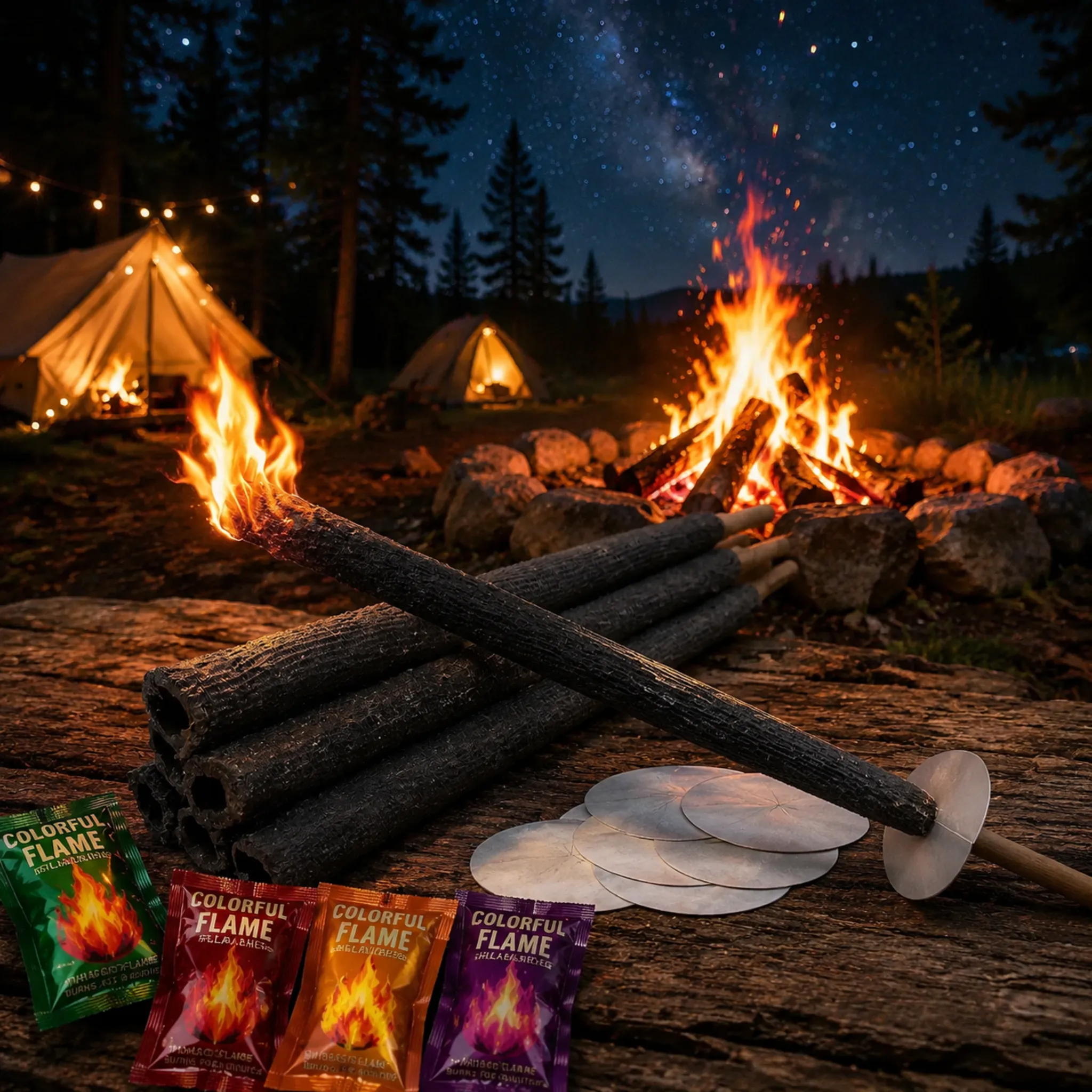
Lighting a fireplace colored pine cone is really two separate jobs. First, you must show the product itself: the purple, red, emerald, blue, and gold coatings, and the metallic gold tips on each scale. Second, you must show the color-changing flames it produces. Those two jobs need opposite lighting logic, so I treat them as two setups.
Setup one: the studio product shot
For the clean catalog shot, I use a soft, even key light and a neutral white or light gray backdrop. Side lighting works best on pine cones. It rakes across the spiral scales and defines the ridges. A harsh bare bulb creates hot specular highlights on the glossy lacquered finish, and that makes hand-painted work look like cheap plastic. Diffusion solves that. If the metallic gold accents still glare, I rotate the cone a few degrees or add a polarizing filter.
Color accuracy is non-negotiable here. Set a custom white balance 3 with a gray card, and shoot RAW so you can correct hues later. Wholesale buyers 4 compare your catalog image against the sample we ship them. If the two do not match, trust drops.
Setup two: the flame scene
For lit shots, the fire itself becomes a light source. It is warm, roughly 1800K, while your key light is around 5500K. Left unbalanced, the whole frame turns orange and the coating colors vanish.
| Element | Studio product shot | Flame lifestyle shot |
|---|---|---|
| Key light | Softbox, 5500K, 45° side angle | Daylight-balanced fill at low power |
| Ambient | Controlled, minimal | Fireplace glow as background |
| ISO | 100–200 | 400–800 |
| Shutter | Any, on tripod | 1/60–1/125 to hold flame shape |
| White balance | Custom gray card | Slightly warm, corrected in post |
| Goal | Color accuracy | Mood plus proof of effect |
Expose for the flame highlights, not the shadows. Blown-out flames read as white and destroy the rainbow effect, which is the entire selling point.
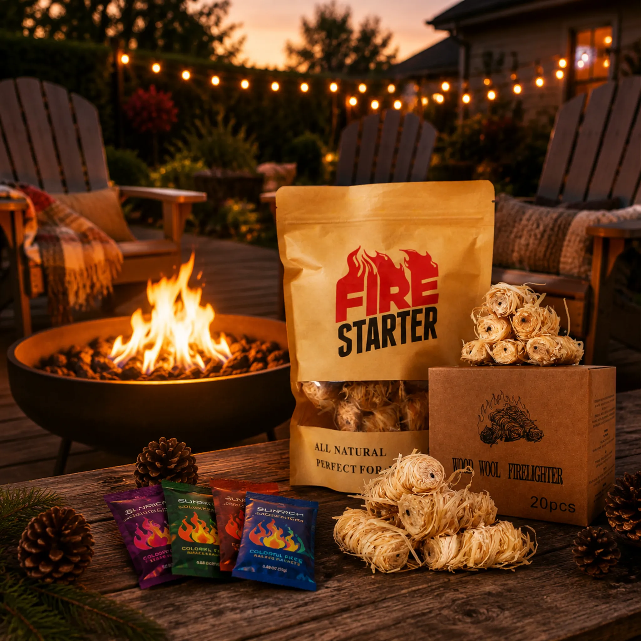
A German distributor once told me he skipped a supplier purely because the catalog photos showed loose cones on a bare table. Packaging shots are where B2B buyers judge shelf-readiness, and we design our burlap sacks and kraft stand-up pouches knowing they will be photographed.
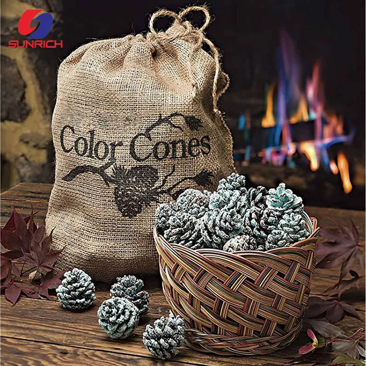
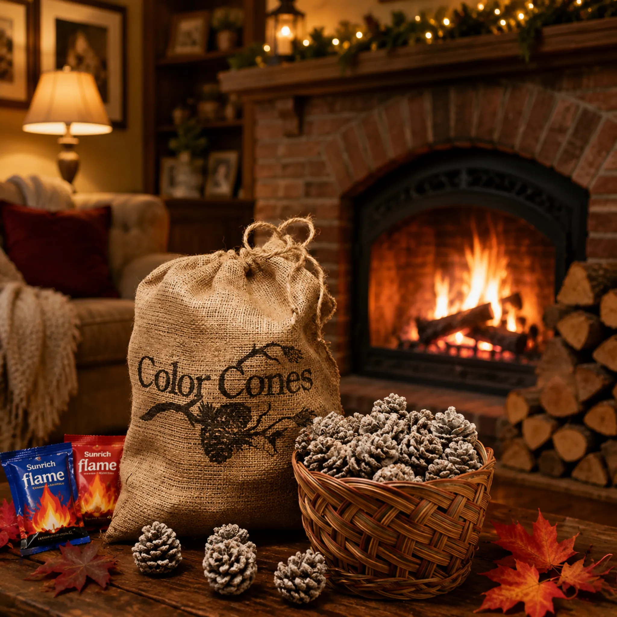
Style packaging shots with minimalist, natural props such as kraft paper, raw wood, jute rope, and a stone hearth. Show the pouch upright and label-forward, with a few cones spilling out, so buyers instantly see a finished, giftable retail product rather than a bulk commodity.

Good product staging tells the buyer a story in one glance: this item is already retail-ready, seasonal, and giftable. Bad staging tells a different story: this is a craft project someone assembled at a kitchen table. The difference is discipline, not budget.
Keep the styling minimal and material-honest
Our packaging already carries rustic cues, such as the coarse burlap weave, the jute drawstring, and the kraft-brown pouch with a clear product window. So the props should echo those materials, not compete with them. I stick to an eco-minimalist palette: recycled paper, raw wood slabs, a hand-woven or copper basket, and a sprig of pine greenery. Two or three props maximum. Negative space around the package keeps attention on the label and leaves room for catalog text or a QR code linking to a flame demonstration video.
Signal giftability and season
These cones sell hardest in Q4, so the styling should slot naturally into any holiday gift guide layout. A softly blurred stone hearth in the background says hearth and home decor without shouting it. A ribbon or gift tag next to the pouch says "ready to wrap." Avoid cluttered rustic scenes with too many pinecones, candles, and fabrics; clutter reads as low-value.
A repeatable packaging shot list
- Front-facing pack shot on white, label perfectly legible, for the price list.
- Angled three-quarter view showing pouch depth and the resealable top.
- Open pouch with three to five cones arranged beside it, showing count and size.
- Lifestyle placement on a mantel or hearth edge, fireplace softly out of focus.
- Group shot of all package formats together, since we offer plastic bags, kraft bags, and jars, so buyers can compare private-label options.
Shoot every SKU with identical lighting and camera position. Consistency across the catalog is itself a premium signal.
What angles or close-ups should I include to show buyers the burn quality and consistent batch size?
Batch consistency is something we obsess over at the factory. Every production run gets sampled for size, coating coverage, and burn time, because a wholesale buyer's first sample must match container number ten. Your catalog images should prove that same consistency visually.
Include an eye-level hero shot of one full cone, a macro close-up of the coated scale tips, a top-down grid of six to twelve cones showing uniform size, and a controlled burn sequence demonstrating steady color-changing flames from ignition to ember.

Buyers cannot handle the product through a catalog page, so your angles must do the handling for them. I break the required shots into three evidence categories: texture, uniformity, and burn performance.
Texture: prove the coating quality
Macro photography 5 techniques matter most here. Get the camera level with the cone, use a macro or close-focusing lens, and focus on the tips of the scales, because that is where texture and the metallic gold detailing are strongest. Use manual focus and stop down to around f/8 or f/11 so enough of the cone stays sharp. Shoppers and buyers zoom into high-resolution product images on screens, so a crisp macro crop of the crystalline coating quietly answers the question "is this well made?"
One caution: extremely shallow depth of field 6 looks artistic but hides information. For a catalog, readability beats mood in detail shots.
Uniformity: prove batch consistency
A single beautiful cone proves nothing about a 10,000-unit order. So shoot a flat-lay grid of cones from directly overhead, evenly spaced, same lighting. Add a ruler or a hand for scale in one frame. If your cones are graded fist-sized, show it.
| Shot type | Angle | What it proves to the buyer |
|---|---|---|
| Hero shot | Eye level, side view | Overall shape and color |
| Macro detail | Level, close crop on scale tips | Coating quality and craftsmanship |
| Flat-lay grid | Directly overhead | Size and color consistency across the batch |
| Scale reference | Eye level with hand or ruler | True dimensions |
| Burn sequence | Tripod, fixed frame, timed intervals | Burn duration and flame stability |
Burn performance: prove the effect
For the burn sequence, lock the camera on a tripod, keep the frame identical, and photograph the same cone at ignition, mid-burn, and late burn. Low ISO and a shutter around 1/60 second holds flame shape while a tripod keeps the cone razor-sharp. This sequence is the visual equivalent of a burn-time spec sheet, and it directly supports the numbers we publish from our QC testing.
Should I add compliance or safety label shots in my catalog to reassure wholesale buyers?
Here is a lesson we learned early in our 17-plus years exporting fire products to the US and Europe: buyers do not ask whether a color-flame product looks fun. They ask whether it will clear customs and survive a retailer's compliance audit. Your catalog should answer before they ask.
Yes. Dedicate at least one catalog frame to compliance: a legible close-up of the warning label, certification marks such as CE, and the barcode area. For fire-related consumables, visible safety documentation is a purchasing requirement for wholesale buyers, not decoration.

Some photographers argue that safety labels clutter a beautiful catalog spread. I understand the instinct, but for fire-related goods it is the wrong call. A purchasing manager at an importer or a Home Depot-type sourcing channel evaluates risk first and aesthetics second. In our experience shipping to 30-plus countries, the catalogs that convert are the ones that make compliance visible.
What to photograph
Shoot the back panel of the packaging flat-on, evenly lit, with every line of the warning text readable at catalog resolution. Then shoot a tighter crop of the certification marks and the barcode. If your supplier holds ISO 9001 7, BSCI, CE, and SGS or Intertek test reports, as we do, photograph the packaging elements that reference them, and mention in the caption that full test reports are available on request. Never photograph or imply certificates the product does not actually hold.
How to present it without killing the mood
Structure the catalog so lifestyle warmth and compliance proof each get their own space:
- Open the spread with the lifestyle product photography: the hearth, the multicolored flames, the cozy scene.
- Follow with clean studio shots and the batch-consistency grid.
- Close with a "trust panel": label close-up, certification marks, barcode, and a short note on eco-friendly composition, since our chemical flame colorants are formulated without harmful chemicals.
- Add a caption stating that packaging, warning labels, and barcodes can be customized for private-label programs.
That last point matters for OEM buyers. When a distributor sees that the label area is already designed for regional warning text and their own branding, it removes a whole negotiation step. The safety shot stops being a legal formality and becomes a sales asset.
Conclusion
Great catalog images of firepl



 English
  Spanish
  German
  French
  Arabic
  Portuguese
Join the Conversation