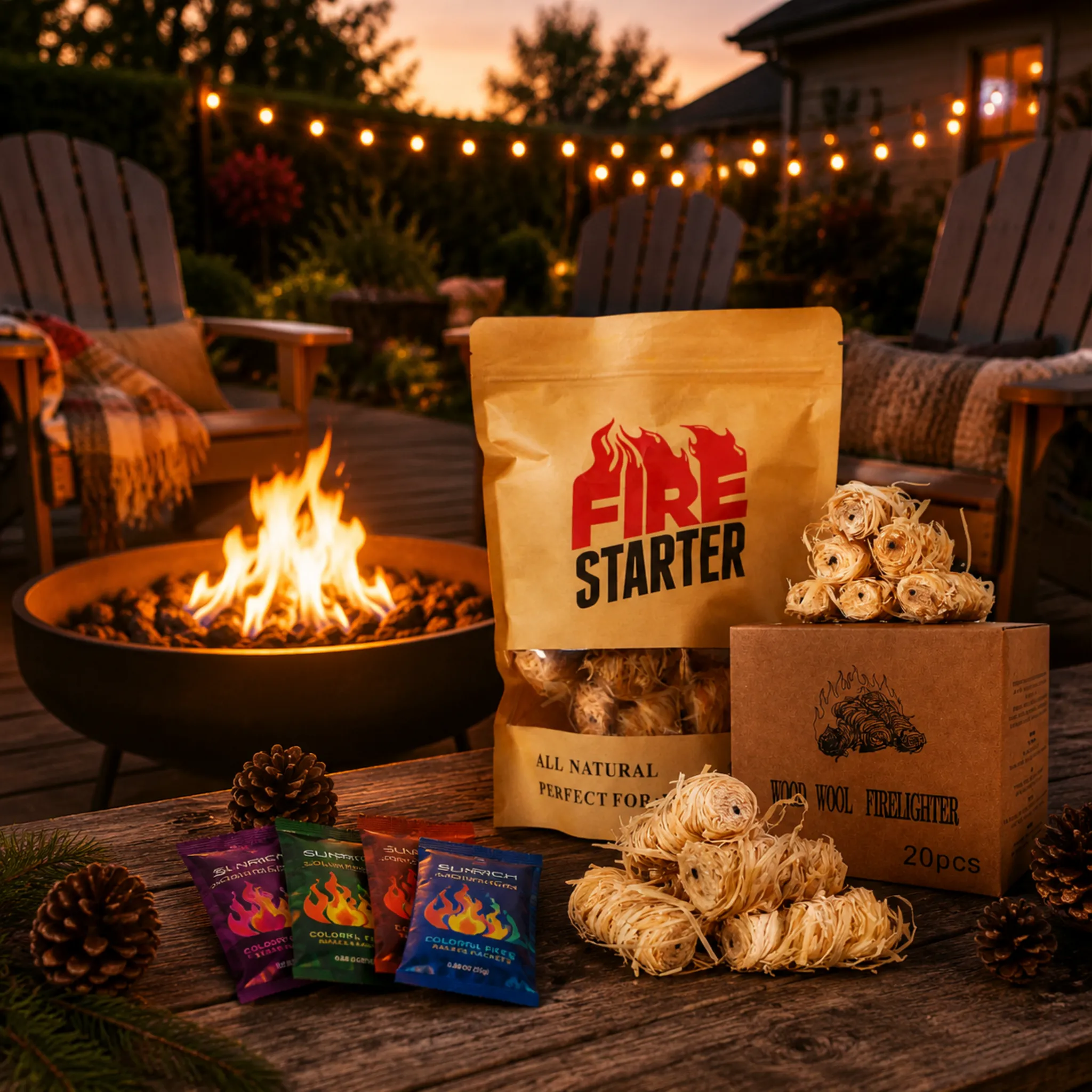
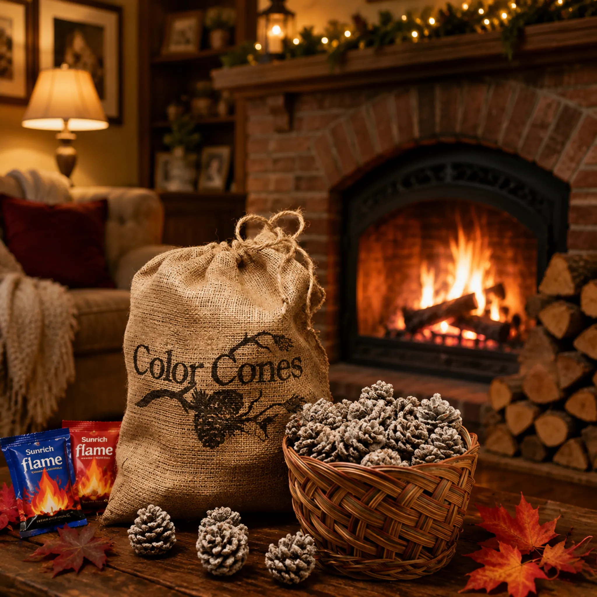
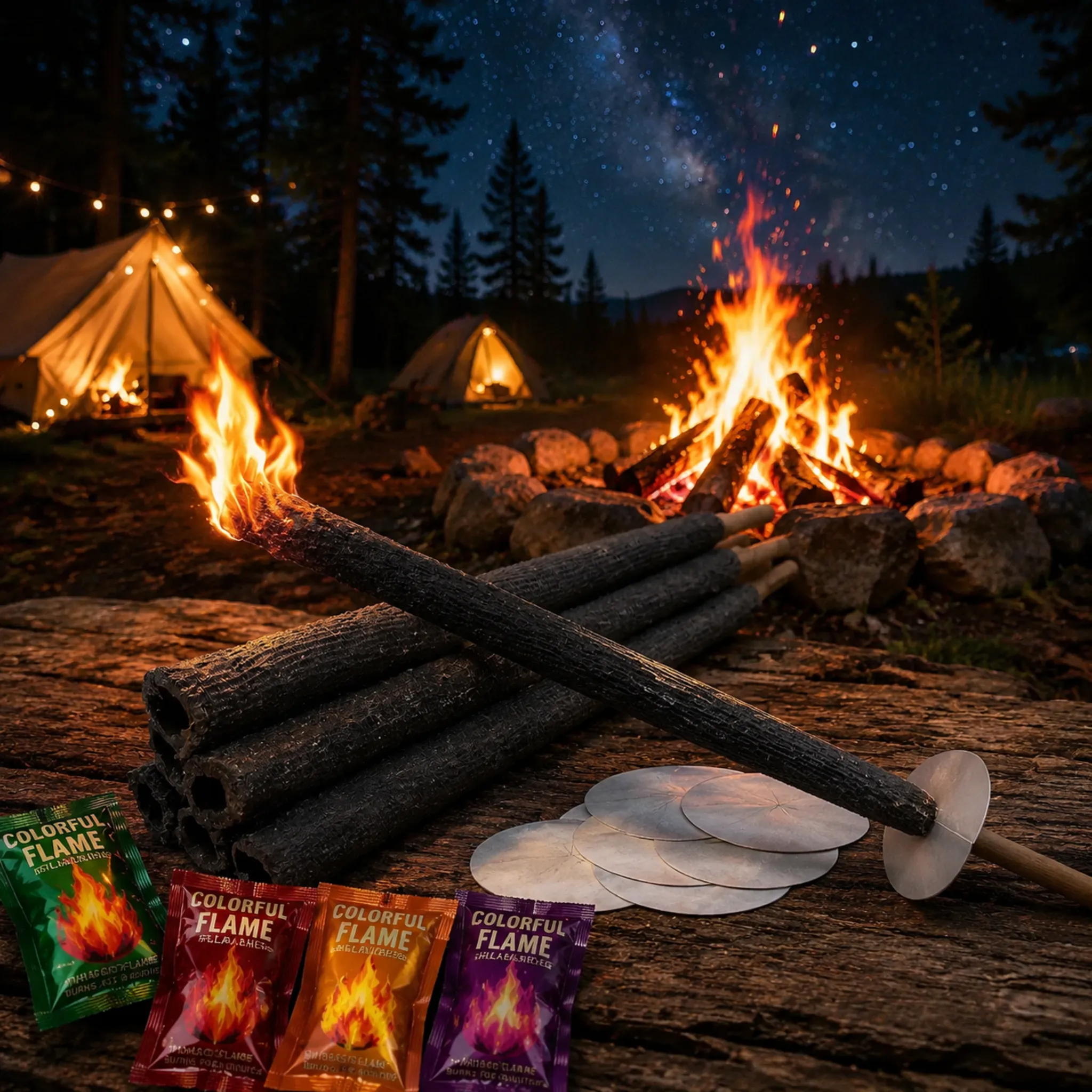

Effect graphics on magic fire powder packaging make or break shelf sales SGS/Intertek certifications 1. I've watched great products die in stores because the pouch looked like plain chemistry, and shoppers walked right past. Our design team in Ningbo learned this the hard way with early export batches, so we rebuilt our artwork around one rule: show the flame, not the powder.
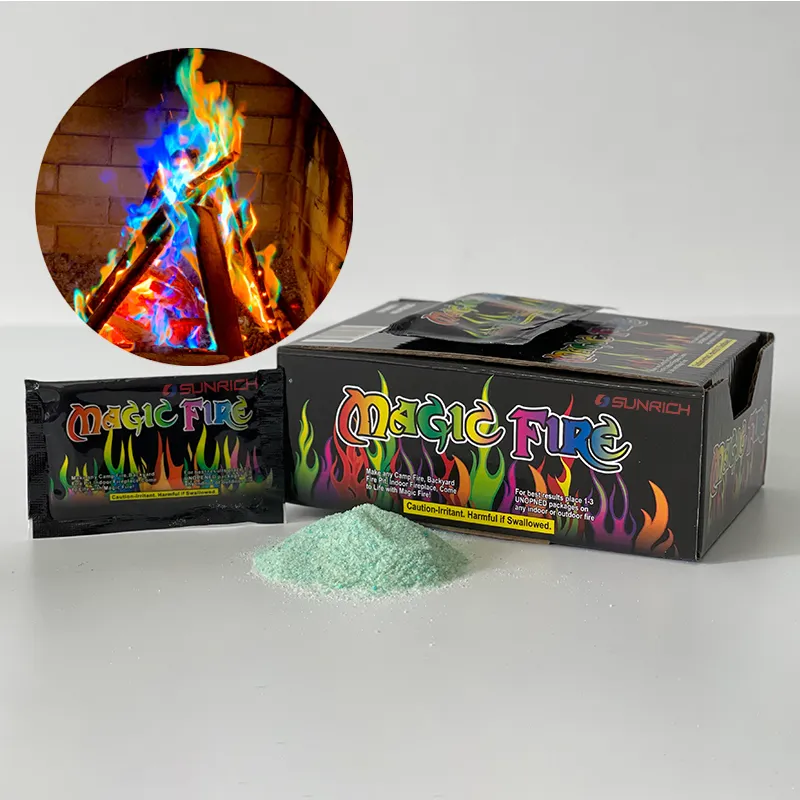
Highlight a large multicolor flame hero graphic on a dark background, a real campfire photo showing colored flames in use, a bold "color-changing fire" benefit callout, toss-in usage icons, and visible safety marks. These effect graphics communicate the transformation in under two seconds and stop shoppers mid-aisle.
That is the short answer. Now let me walk you through each decision, using what we have learned from seventeen-plus years of producing and packaging color-flame products for buyers in over thirty countries.
How Can I Choose Flame-Color Visuals That Accurately Represent My Magic Fire Powder's Effects?
During a QC session at our Ningbo plant, we once compared a printed pouch against live burn footage. The printed flames looked neon pink; the real flames burned magenta-violet. That mismatch teaches an important lesson.
Choose flame visuals that match your powder's real burn colors—typically green, blue, purple, orange, and red—rendered as one large multi-color plume on a black or deep-navy background. Add a circular inset photo of an actual colored campfire to prove the effect is real, not exaggerated.

Accuracy matters more than most brands assume. If your artwork promises electric rainbow flame effects but the actual fire produces softer teal and violet tones, you invite returns, bad reviews, and lost repeat orders. We always burn-test each batch and photograph the results before we approve final artwork for a private-label client. The printed plume should be an honest, slightly idealized version of the real burn.
Match Artwork to Chemistry
Different colorants produce different hues. Your vibrant color palette on the pouch should map to what the powder actually does in a fire pit. Here is the framework we share with buyers during OEM projects:
| Real Flame Color | Best Print Representation | Shopper Signal |
|---|---|---|
| Blue-green | Saturated teal gradient | Novelty, "wow" factor |
| Purple | Violet-to-magenta blend | Mystical, premium feel |
| Orange-red | Warm gradient base layer | Familiar fire, comfort |
| Yellow-white | Bright highlight accents | Energy and brightness |
Why Dark Backgrounds Win
Bright flames read as brighter when they sit on black, charcoal, or night-sky navy. This is basic contrast science 2, and it works both on physical shelves and in marketplace thumbnails. Our best-selling foil pouch design uses a glossy black base precisely because the rainbow-gradient flames pop against it. Light backgrounds flatten flame colors and make the product feel generic.
Finally, avoid abstract powder-texture graphics. Shoppers buy the outcome—colored fire—not crystals. Show the transformation, and show it big.
What Certification and Safety Icons Should I Include Alongside Effect Graphics to Build Buyer Trust?
A German distributor once told me flatly: no visible compliance marks 3, no purchase order. That conversation shaped how we lay out every warning panel we print today.
Include CE marking where required, third-party test verification such as SGS or Intertek, clear "toss-in, do not open" icons, a crossed-out cooking symbol, age-restriction and keep-away-from-children warnings, and flammability pictograms. Position them cleanly at the bottom so they build trust without killing the fun.
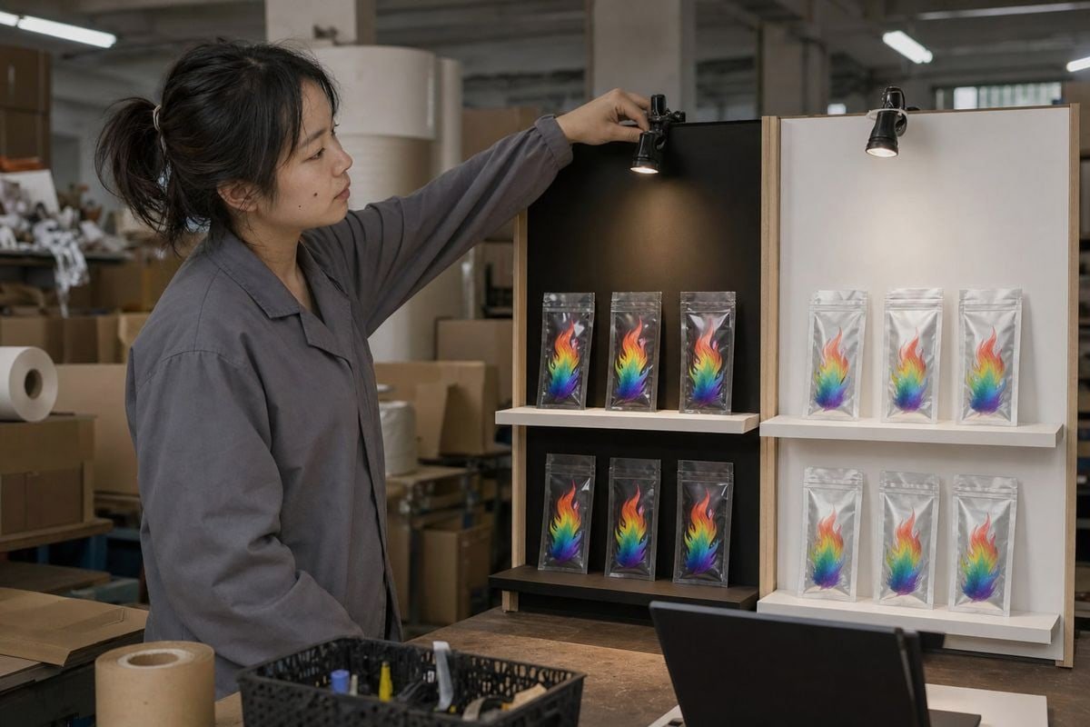
Fire products live in a safety-sensitive category. Retail buyers—especially in the US, Germany, the UK, and France—will reject shelf-ready packaging that lacks proper marks, no matter how attractive the flame graphics are. Our factory holds ISO 9001 4, BSCI, CE, and SGS/Intertek certifications, and we supply test reports with every export batch, because for serious importers this is a hard requirement, not a nice-to-have.
Here is a practical objection I hear often: "Won't safety icons make the pack look scary and hurt impulse sales?" The opposite is true when you handle visual hierarchy correctly. Safety cues placed in a tidy strip along the bottom edge actually reassure gift buyers and parents. What hurts sales is packaging that looks like a lab chemical container—hazard-heavy, clinical, and joyless. The fix is placement and proportion, not omission.
The Trust Stack We Recommend
- Benefit promise at the top: large product name plus "color-changing flames."
- Hero flame graphic in the middle: the emotional hook.
- Usage icons below: toss-in sachet, burn duration, indoor/outdoor suitability.
- Safety strip at the bottom: warnings, crossed-out marshmallow, certification marks, barcode.
Icons That Prevent Misuse
The two most important behavioral icons are the "toss the whole sachet in—do not open" graphic and the "no cooking over colored flames" symbol. Both prevent hazardous misuse and reduce liability exposure for your brand. We print these on every client pouch, and we can adapt the warning language to each destination market's regulations, from EU standards 5 to Australian retail requirements.
Can I Customize Packaging Graphics and Branding to Match My Retail Market's Shopper Preferences?
One trade-off we weigh constantly is standardization versus localization. A single global design is cheaper to print, but campers in Canada and festival gift traders in the Middle East respond to very different visual cues.
Yes. A capable OEM/ODM factory can fully customize pouch material, artwork, private-label branding, warning language, barcodes, and display boxes for each market segment—camping, party, gift, or seasonal—while keeping the core rainbow flame identity consistent across your product line.

Customization is where distributors win margin. Our one-stop OEM/ODM service 6 covers everything from foil sachets and kraft stand-up pouches to plastic jars and flip-top display boxes, and we have run private-label projects for outdoor brands, BBQ distributors, and large retail sourcing channels across the US and Europe. The graphics should flex to the audience while the compliance backbone stays fixed.
Match Graphics to Your Buyer Segment
| Audience | Packaging Format | Graphic Direction |
|---|---|---|
| Campers & outdoor brands | Kraft pouch or rugged foil sachet | Campfire scene, night-sky backdrop, fire pit enhancements messaging |
| Party & festival buyers | Glossy foil with neon accents | Burst compositions, spark trails, celebratory energy |
| Gift & seasonal shoppers | Flip-top display box | Mystical motifs, holographic printing, giftable framing |
| Home hearth users | Jar or resealable pouch | Cozy fireplace imagery, refined typography |
Seasonal and Regional Variants
Occasion-specific variants are a proven trend. A "Midnight Purple" Halloween edition or a patriotic red-and-blue summer version gives retailers a reason to reorder throughout the year. We have produced holiday-themed runs for European clients where only the accent colors and seasonal motifs changed, keeping plate costs manageable. Holographic or iridescent foil stamping is another upgrade worth considering—it physically mimics the shifting, multi-tonal nature of the flame effect and elevates perceived value for gift positioning.
One caution: do not localize so aggressively that your brand loses recognition. Keep the logo, the flame hero graphic, and the dark base consistent. Vary the scene cues, the accent palette, and the language panels. That balance keeps your line shelf-coherent while speaking to each shopper group in outdoor entertaining, party, or gift contexts.
Which Design Elements Actually Boost Shelf Appeal and Sales for Color-Flame Products in Retail Stores?
Years of trade-show feedback taught us a blunt truth: buyers judge a pouch in about two seconds. If the benefit is not instantly obvious at arm's length, the design has already failed.
The highest-impact elements are a dominant multicolor flame plume, a short bold promise like "Color-Changing Fire," strong dark-background contrast, one contextual campfire image, duration callouts such as "60 minutes," and restrained metallic accents. Rank these by visual hierarchy and cut everything else.

Shelf appeal is not decoration; it is prioritization. The most common mistake we see in client-supplied artwork is visual noise—too many sparkles, competing fonts, cluttered backgrounds, and weak product naming. A rainbow flame is powerful, but a rainbow everything is chaos. Clean hierarchy sells.
The Two-Second Shelf Test
Ask three questions of any draft design. Can a shopper name the product category from six feet away? Can they state the benefit in one phrase? Do they know how to use it? If any answer is no, simplify until all three pass.
Element Priority Ranking
| Priority | Element | Job on the Pack |
|---|---|---|
| 1 | Product name + "color-changing fire" promise | Instant category and benefit recognition |
| 2 | High-saturation flame hero graphic | Emotional stop-power |
| 3 | Campfire or fireplace context photo | Proof and use-case clarity |
| 4 | Duration and toss-in icons | Practical purchase confidence |
| 5 | Sparkle accents and background flourishes | Polish only—never dominant |
Physical Shelf vs. Digital Thumbnail
Modern packaging must work twice. In a Home Depot-style aisle, glossy black foil with vivid flame imagery catches overhead lighting and stands apart from traditional fireworks-style clutter. In a marketplace thumbnail, the same design must stay legible at postage-stamp size—which is why bold bubble lettering and a single dominant plume outperform intricate illustrations. Some clients now add a QR code 7 linking to burn-demo video or an AR flame preview; it costs almost nothing to print and bridges the shelf-to-screen gap. A minimalist "dark mode" aesthetic with neon-line accents is also gaining ground as campfire accessories buyers push back against busy legacy designs.
Conclusion
Weak packaging buries great products. Lead with a multicolor flame hero on dark ground, prove the effect, layer in trust marks, and customize per market—then your shelf appeal converts.
Footnotes
1. SGS is a leading third-party testing body verifying product safety claims. ↩︎
2. Explains the visual perception principle behind dark backgrounds boosting flame color brightness. ↩︎
3. Background on CE marking, the compliance mark distributors demand before purchase. ↩︎
4. Authoritative government source (NIST) providing a comprehensive overview of ISO 9001 quality management. ↩︎
5. WTO's technical barriers framework explains cross-market regulatory adaptation for exporters. ↩︎
6. Alibaba is a major sourcing platform illustrating global OEM/ODM manufacturing arrangements. ↩︎
7. Background on QR code technology used to bridge shelf packaging to digital demos. ↩︎



 English
  Spanish
  German
  French
  Arabic
  Portuguese
Join the Conversation