
Custom packaging printing per brand VI is where I see most buyers stumble SGS/Intertek test reports 1. On our production line, a weak brief means wrong colors, delayed proofs, and packaging that hurts the brand it should build.
To request custom packaging printing per brand VI when sourcing wood fire starters, send the supplier your VI guide, vector logo files, Pantone color codes, panel-by-panel copy, compliance text, pack format, and target MOQ, then approve a digital and physical proof before mass production begins.
That single paragraph is the whole workflow. Now let me walk you through each step, using what we have learned from 17+ years of OEM manufacturing and exports to 30+ countries.
What Information Should I Prepare Before Requesting Custom Brand VI Packaging Printing?
A German distributor once sent us a screenshot of his logo pulled from his own website. Our pre-press team had to pause his wood firestarter project for two weeks while his designer rebuilt the files.
Before requesting custom brand VI packaging printing, prepare vector logo files (AI, EPS, or PDF), Pantone color codes, brand fonts, panel copy for every side, safety and warning text, barcode or SKU data, exact pack dimensions, and your target order volume.

The quality of your brief decides the quality of your packaging. In our OEM projects for private label firelighters, the buyers who prepare a complete asset package get their first proof approved in one round. The buyers who send fragments go through three or four revision cycles. Each cycle adds days to the lead time.
The Core Asset Checklist
Here is the exact list we ask every buyer to prepare before we open a packaging file:
| Asset | Format Required | Why It Matters |
|---|---|---|
| Logo | Vector (AI, EPS, PDF) | Prevents pixelation on kraft paper bags and textured board |
| Brand colors | Pantone codes 2, not screen values | Enables true Pantone color matching on press |
| Typography | Licensed font files or outlined text | Keeps headlines consistent with your VI system |
| Panel copy | Editable text per panel | Front, back, sides, and top all carry different content |
| Barcode | EAN/UPC number plus GS1 file 3 | Retailers reject unscannable codes |
| Dimensions | Millimeters, per pack format | Drives die-cut templates and freight planning |
Compliance Text Comes First, Not Last
Warning statements, usage instructions, composition details, and market-specific marks must enter the design at the start. In our experience exporting to the US, Germany, and the UK, retailers check safety text before they check the logo. If your market requires FSC certified packaging symbols or a "Ready to Burn" style certification mark, tell your supplier in the first email. Adding a compliance logo after the artwork is locked forces a full re-layout, because panel space is always tighter than buyers expect.
Describe Your Sales Channel
Also state where the product will sell. A wood firestarter box for a Home Depot–type shelf needs bold facing graphics and a hang-ready or stackable structure. A gift-style kit for a festival trader needs premium finishes. We design differently for each, so this one sentence in your brief saves real money.
How Do I Make Sure My Logo Colors and Fonts Match My Brand VI Exactly on Printed Packaging?
Color drift is the complaint I take most seriously. Early in our export history, a buyer approved a screen proof, and the printed kraft boxes came out warmer than his brand orange. We reprinted the run, and we changed our proofing process permanently.
To match your brand VI exactly, supply Pantone codes instead of RGB or HEX values, request a printed press proof on the actual packaging substrate, outline or license your brand fonts, and define an acceptable color tolerance in writing before production.

Screens lie. Every monitor renders color differently, and CMYK printing on paper never looks identical to a backlit display. That is why serious brand VI work always anchors on Pantone. When we calibrate a print run for a wood firestarter box, our team matches the Pantone chip under standard lighting, not a customer's phone photo.
Why the Substrate Changes Everything
The same ink behaves differently on different materials. Uncoated kraft paper bags absorb ink and mute colors. Coated white board keeps colors bright and true. If your brand orange must look identical across a printed box, a kraft bag, and a label, your supplier needs to adjust the ink formula for each substrate. Ask directly: "Will you adjust ink density per material to hold my Pantone target?" A capable factory will say yes and explain how.
A Practical Color Control Sequence
- Send Pantone codes from your official VI guide.
- Ask which substrate the supplier recommends for your pack format.
- Approve the digital proof for layout only, not color.
- Request a physical press proof or pre-production sample on the real material.
- Compare it against a Pantone swatch book, not a screen.
- Sign off with a written tolerance, such as an agreed Delta E range 4.
Fonts Deserve Equal Attention
Typography drift is subtler than color drift, but retailers notice it. Send your actual font files if licensing allows, or ask your designer to convert all text to outlines in the artwork file. This prevents the pre-press software from silently substituting a similar font. On our line, we flag any live text in a customer file before output, because one substituted typeface can break an entire visual identity system.
What Packaging Formats and Printing Options Can I Choose for My Wood Fire Starters?
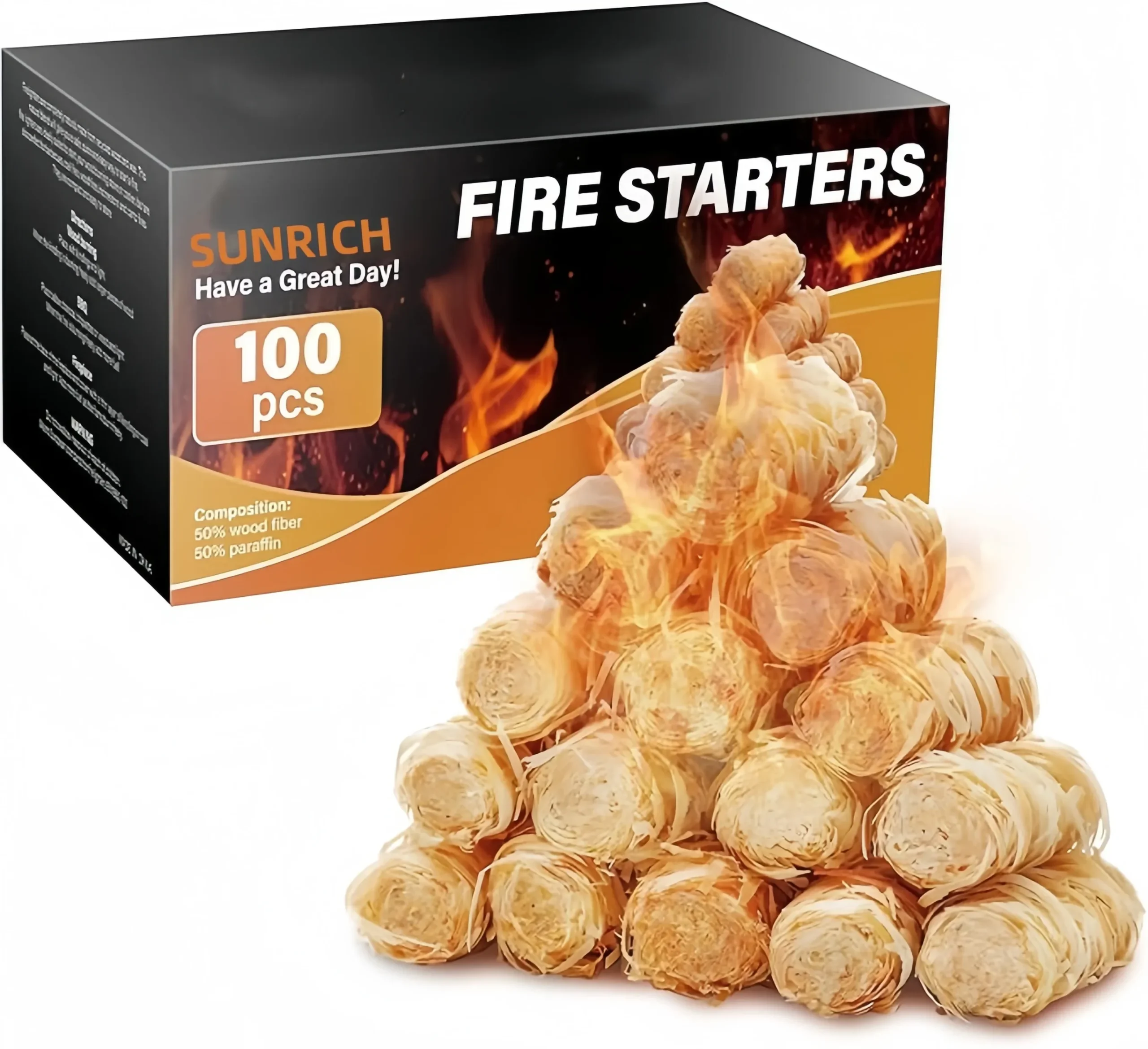
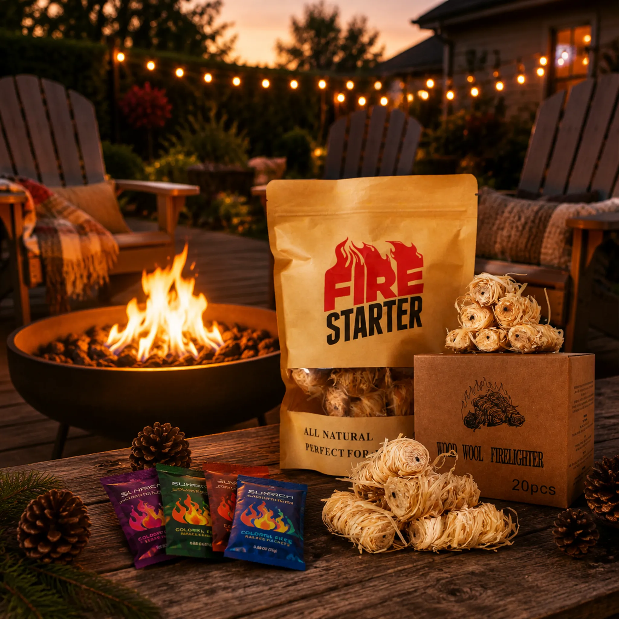
Buyers often assume one box fits all channels. When we developed our wax-dipped wood roll firestarters, we ended up tooling several formats because our camping brand clients and our fireplace distributor clients needed completely different shelf presentations.
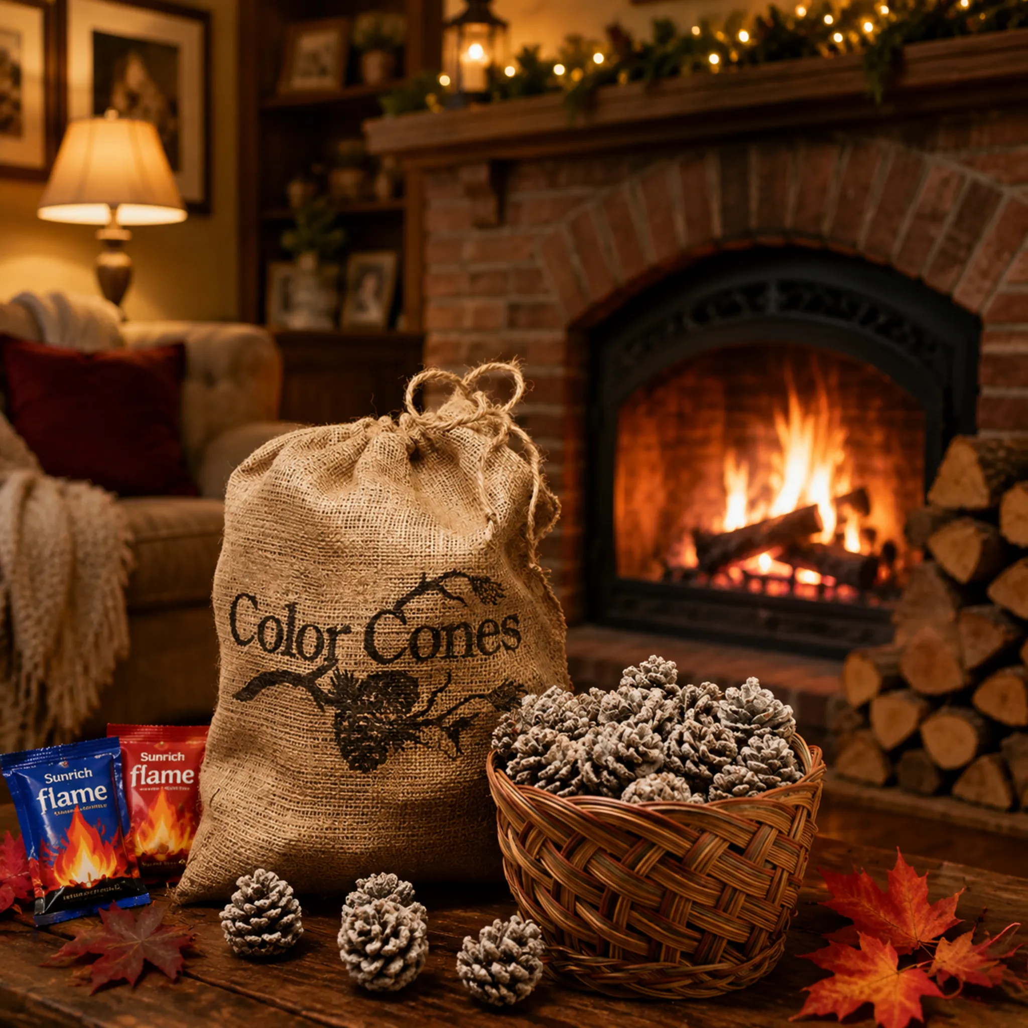
Wood fire starters can ship in printed retail boxes, custom-labeled kraft paper bags, stand-up pouches, branded tins, or gift-style kits, printed via offset for cartons, digital for small runs, or gravure for high-volume flexible packaging.

Your pack format is a branding decision and a logistics decision at the same time. Each option carries its own cost curve, Minimum Order Quantity (MOQ), and shelf behavior. Here is how we frame the choice for our B2B buyers:
| Format | Best For | Typical MOQ Range | Branding Strength |
|---|---|---|---|
| Full-color printed box | Retail shelf, big-box channels | 1,000–3,000 units | High: all six panels printable |
| Kraft bag with custom label | Trial orders, eco positioning | Low: labels print cheaply | Medium: front-panel focus |
| Stand-up zipper pouch | Outdoor and camping displays | Often 10,000 per design | High, but gravure plates cost more |
| Branded tin | Gifting, premium fireplace lines | Moderate | Very high, reusable keepsake |
| Gift kit or display box | Festivals, seasonal promotions | Flexible | High, tells a full brand story |
Matching Print Method to Volume
Offset printing gives clean, consistent color on folding cartons and suits most retail-ready packaging runs. Digital printing has no plate costs, so it works well for market testing under 1,000 units, even though the unit price runs higher. Gravure delivers excellent quality on flexible film but only makes sense at high volumes because cylinders are expensive to engrave.
The Sustainability Angle
Paper-based packaging is now a genuine selling point, not a niche request. Many of our European buyers position their products as eco-friendly firelighters, and the packaging must back that claim. FSC certified packaging board 5, recyclable kraft structures, and vegetable-based inks all reinforce a clean-burn, sustainable sourcing story. One practical tip from our line: if any packaging element could end up in the fire as kindling, specify non-toxic inks in your purchase order. It costs little and protects your brand promise.
Use Existing Die-Cut Templates When You Can
Ask your supplier for their standard die-cut templates before commissioning a custom shape. Using a proven die-line cuts tooling cost, shortens lead time, and removes structural risk, while your VI still does all the differentiation work through graphics.
How Do I Confirm Print Quality and Compliance Before Approving Mass Production?
A UK importer once asked me why we insist on a signed pre-production sample when his digital proof already looked perfect. Three weeks later, that physical sample caught a barcode printed too close to a fold line. His retailer's scanner would have rejected it.
Confirm quality by reviewing a digital proof for layout, then a physical pre-production sample for color, barcode scannability, warning text, and finish, and only sign written approval after checking spelling, panel placement, regulatory marks, and shipping carton label space.

Proof approval is your last checkpoint before money becomes cardboard. After that signature, every error multiplies by your order quantity. So treat this stage like a formal inspection, not a formality. At our factory, we send artwork proofs as PDFs quickly, but we never push a buyer to skip the physical sample stage, because batch-to-batch consistency starts with a correct master reference.
The Two-Stage Proofing Workflow
Stage one is the digital proof. Check content only: spelling, panel placement, barcode number, ingredient and composition text, usage instructions, and warning statements. Read every word aloud. Errors hide in text you skim.
Stage two is the physical sample or press proof. Check execution: Pantone accuracy against a swatch book, finish quality, board thickness, fold strength, and how the box performs when filled with actual wood firestarters. Scan the barcode with a real retail scanner app. Confirm the pack survives a shake test without shedding wood fiber.
The Compliance Layer
| Check Item | What to Verify | Consequence If Missed |
|---|---|---|
| Warning text | Correct language and market wording | Retail delisting or customs holds |
| Certification marks | Test reports match printed claims | Legal exposure in EU/US markets |
| Hazard labeling space | Outer cartons fit flammable solid labels without covering logos | Freight rejection or relabeling fees |
| Barcode | Scans on first pass, correct quiet zones | Chargebacks from retailers |
| Origin and importer info | Required fields present per market | Border clearance delays |
Because our own products carry CE marking 6 and SGS/Intertek test reports, we cross-check that printed claims match documentation before every run. Ask your supplier to do the same, in writing. Also consider one modern addition: a QR code 7 on the back panel linking to fire-starting tutorials or safety guidance. It adds brand value after purchase and needs zero extra print cost.
Conclusion
Weak packaging briefs waste time, money, and shelf impact. A structured brief — VI assets, Pantone codes, panel copy, compliance text, proofs, and aligned MOQ — turns custom packaging printing into a predictable, brand-building process.
Footnotes
1. Official testing body referenced for compliance documentation verification. ↩︎
2. Background on the color standard system used for brand color matching. ↩︎
3. GS1 is the authoritative body governing barcode data standards mentioned. ↩︎
4. Explains the color science metric used for print tolerance approval. ↩︎
5. FSC standard directly relevant to sustainable packaging claims discussed in article. ↩︎
6. Explains the regulatory marking referenced for product compliance verification. ↩︎
7. Authoritative Wikipedia entry covering QR code technology and international ISO standards. ↩︎



 English
  Spanish
  German
  French
  Arabic
  Portuguese
Join the Conversation