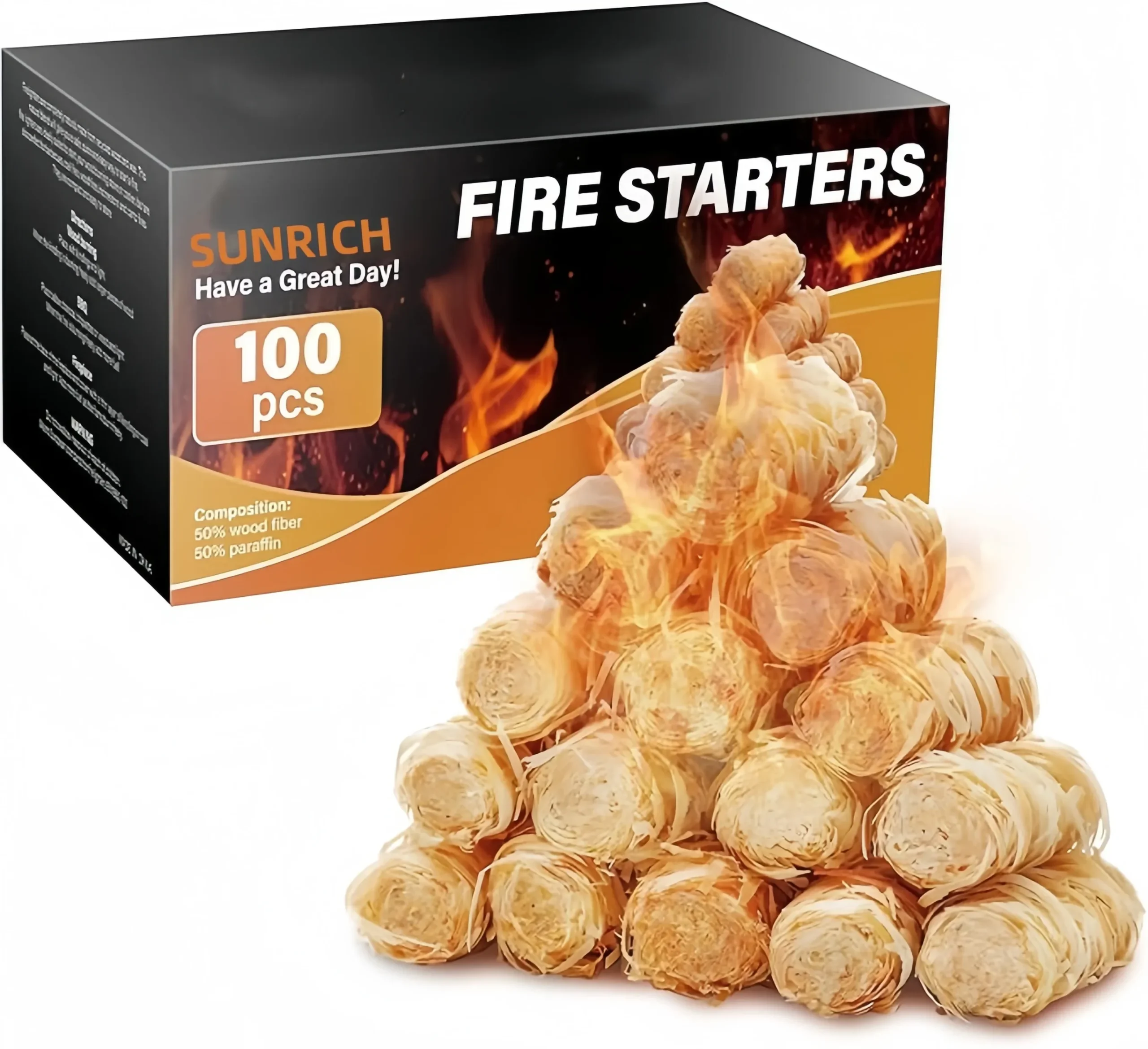
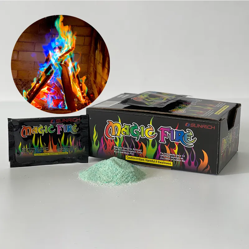

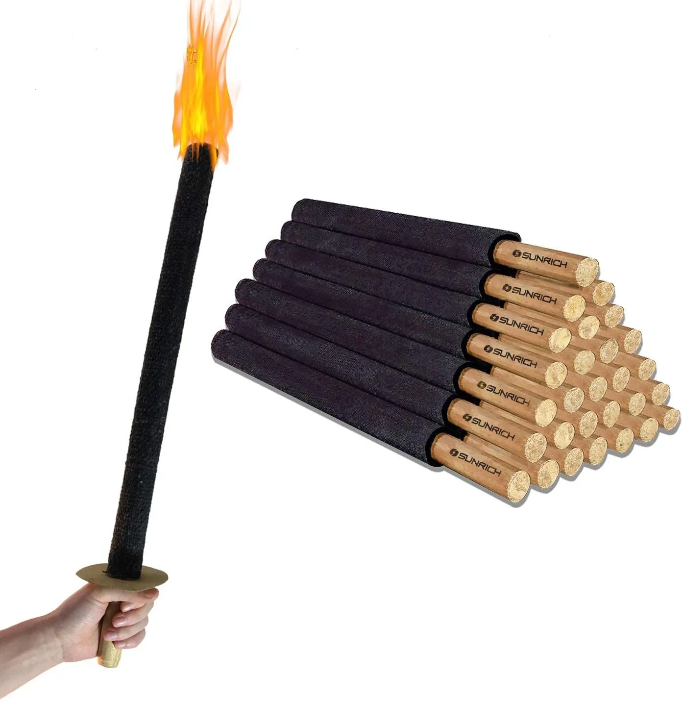



Balancing brand visuals with safety labels on wood fire starter listings is a problem I face weekly on our packaging line certificações SGS/Intertek 1. A beautiful box that hides its warnings gets rejected — by regulators, or worse, by customers who stop trusting you. After 17 years of shipping wax-dipped wood rolls to 30+ countries, we have learned how to make both work together.
To balance brand visuals with safety labels on wood fire starter listings, use visual hierarchy: put branding on the front panel, reserve a dedicated high-contrast zone for flammable solid warnings, follow CPSC labeling requirements and CE norms, and add a close-up safety image in your listing gallery.
That is the short answer. Below, I break down each part — packaging consistency, label sizing, compliant custom branding, and how real importers handle the US and EU differently.
How can I keep my brand’s packaging design consistent while meeting mandatory fire safety warning requirements?
A German buyer once sent us artwork with warnings printed in pale grey over a kraft-paper texture. It looked premium. It also failed his own compliance review before we even printed a sample.
Keep branding consistent by zoning your packaging: dedicate the front panel to your logo, colors, and product identity, then place all mandatory fire safety warnings in a fixed, high-contrast block on the back or bottom panel that repeats identically across every SKU.
The core idea is simple: brand consistency and safety compliance stop fighting each other the moment you give each one its own territory. This is called information zoning, and it is the foundation of good visual hierarchy 2 in design. The front of the pack sells. The back of the pack informs. Neither invades the other.
Build a fixed warning block
We advise our OEM clients to design one standardized warning panel and lock it. It contains the signal word (WARNING or DANGER), the flame pictogram 3, plain-language cautions like "Keep away from children" and "Use outdoors or in a ventilated fireplace," and composition details such as wood fiber and paraffin content. That block never changes shape, contrast, or font across your product family. Your brand elements can evolve seasonally. The warning block stays identical. That repetition is what makes the whole range feel consistent, not fragile.
Contrast and typography rules that protect both sides
Rustic kraft backgrounds are popular for wood fire starters, but they kill contrast. So we print warnings on a solid neutral panel instead of directly over texture. Practical baselines we follow:
| Design element | Recommended practice | Por que importa |
|---|---|---|
| Text-to-background contrast | ~70% or higher | Warnings stay legible on kraft or dark gradients |
| Warning font | Plain sans-serif, no decorative type | Fast reading under real-world conditions |
| Minimum warning text size | 6pt critical info, 8pt primary copy | Meets legibility expectations in print |
| Fonts per package | 2–3 maximum | Keeps hierarchy clean and premium |
| Negative space | 20–30% of the panel | Prevents crowding around hazard text |
Minimalist packaging design 4 actually helps here. Fewer fonts and more white space give warnings room to breathe while keeping the natural, premium look wood products deserve.
What size and placement rules should I follow so safety labels don’t overwhelm my product photos on Amazon or retail listings?
One trade-off we weigh constantly during artwork review: a warning big enough to satisfy print compliance can still be invisible in a mobile thumbnail. Print rules and screen rules are not the same.
On listings, keep your main image clean and brand-led per Amazon product image guidelines, then dedicate one gallery image to a zoomed, readable safety label. On packaging, size warnings at 6–8pt minimum, placed on back or bottom panels — visible but secondary to branding.

A label that passes print compliance can still be unreadable at 160 pixels wide. That is the trap most new fire starter sellers fall into. The fix is to treat packaging and listing images as two separate design jobs with two separate rulebooks.
Split your listing gallery by function
We help clients structure their image sets like this:
- Main image: clean product on white, brand visible, no overlaid warning text competing for attention.
- Lifestyle image: fire pit, grill, or fireplace scene. Good lifestyle photography composition sells the emotion — but never place safety text over flames, wood grain, or dark gradients.
- Safety close-up: a dedicated shot or product infographic layout showing the warning panel at full legibility. This is where buyers can actually read the flammable solid warnings 5.
- Usage instructions: step-by-step visuals with icons paired with short text.
Use the platform's own safety tools
Amazon provides hazard flagging and warning fields at the listing level. Use them. They fulfill part of your duty to warn 6 before the physical product ever arrives, and they take pressure off your hero image.
Apply a Z-pattern hierarchy
On infographic images, place your logo top-left where the eye enters, and the warning statement bottom-right where the eye exits. Both get processed in sequence without competing. In our experience preparing listing kits for US and EU clients, this single layout habit resolves most of the "the warning ruins my photo" complaints.
Can I get custom-branded wood firestarter packaging that still passes CE and SGS compliance checks?
Last year, a UK distributor asked us whether private-label artwork would "break" his SGS report. It is one of the most common questions we hear during OEM onboarding — and the answer is reassuring.
Yes. Custom-branded wood firestarter packaging passes CE and SGS checks when the product formula stays within the tested specification and the artwork preserves mandatory elements: hazard communication symbols, signal words, composition disclosure, and traceability details. Branding freedom applies to everything else.

Compliance testing evaluates two things: the product itself and the information on the packaging. Your logo, color palette, box structure, and lifestyle imagery are not what the lab scrutinizes. What matters is that the required elements are present, legible, and accurate. At our factory in Ningbo, we run every custom artwork file through a pre-print compliance check against the client's target market before anything goes to plate. Our ISO 9001 7, BSCI, CE, and SGS/Intertek certifications only hold value if each private-label batch matches the tested spec — so we lock the formula (for example, 50% wood fiber, 50% paraffin) and control it batch to batch.
What is fixed vs. what is flexible
| Elemento | Flexible for branding? | Notas |
|---|---|---|
| Logo, tagline, brand colors | Sim | Full freedom on front panel |
| Box structure and finish | Sim | Display boxes, kraft, gradient print, peel-and-reveal labels |
| Flame pictogram and signal word | Não | Must remain standardized and high-contrast |
| Composition and quantity statement | Não | Must match tested product exactly |
| Warning language and translations | Parcialmente | Wording per market; multi-language layers allowed |
| Importer/manufacturer traceability | Não | Required for EU market surveillance |
Practical customization options
For clients who want a fully premium front panel, we offer peel-and-reveal multi-layer labels that tuck multi-language regulatory text under a branded top layer. For products sold loose or in display trays, printing or engraving a permanent warning on the inner unit ensures the caution survives after the outer box is discarded. Both approaches pass third-party review because the information remains accessible — it is placement engineering, not omission.
How do other importers balance private-label branding with clear hazard labeling across different markets like the US and EU?
Shipping the same wood fire starter to Texas and to Poland taught us an early lesson: one artwork file rarely serves both markets well. Successful importers plan for divergence from day one.
Experienced importers use one global brand system with market-specific warning panels: US packaging follows CPSC labeling requirements and ASTM safety standards conventions, while EU packaging carries CE-aligned hazard communication symbols and multi-language warnings. The brand layer stays constant; the compliance layer swaps.

The smartest private-label buyers we work with treat regulatory compliance for packaging as a modular system. They design a master template with a locked brand zone and an interchangeable compliance zone. Then they localize only the compliance zone per destination. This keeps shelf identity consistent worldwide while each market gets exactly the warnings it expects.
How the two markets differ in practice
| Aspect | US market approach | EU market approach |
|---|---|---|
| Warning framework | CPSC labeling requirements; ANSI-style signal words (WARNING/DANGER) | CLP-aligned pictograms and CE conventions |
| Idioma | English (sometimes Spanish added) | Multi-language mandatory per destination country |
| Standards references | ASTM safety standards conventions for consumer fire products | Harmonized EU norms; SGS/Intertek reports widely requested |
| Common label solution | Single back-panel warning block | Peel-and-reveal or booklet labels for 5–10 languages |
| Retail expectation | Bold, action-oriented cautions | Standardized pictograms plus traceability details |
Three habits of importers who get it right
First, they never let the front panel carry compliance load. Branding lives up front; hazards live in the fixed zone. Second, they request compliance documentation before artwork begins — our EU clients routinely ask for test reports at the quotation stage, and we consider that best practice, not friction. Third, they audit their listing images the same way they audit packaging, because a compliant box paired with a warning-free listing still creates duty-to-warn exposure online.
One important caution I share with every new buyer: requirements vary by product category and destination, so verify specifics with your own compliance advisor or test lab rather than relying on general design principles alone. We supply the reports and the flexible artwork; your market defines the final rulebook.
Conclusão
Hidden warnings destroy trust; oversized warnings destroy shelf appeal. The fix is zoning: brand up front, high-contrast safety panels behind, market-specific compliance layers, and a readable safety image in every listing. Done right, safety labeling becomes a brand-quality signal that sells. If you need compliant, private-label wood fire starters with shelf-ready packaging, our team is ready to help.
Notas de rodapé
1. SGS is a leading testing body whose certifications validate compliance claims described. ↩︎
2. Explains the design principle underlying the zoning strategy described for packaging layout. ↩︎
3. Official OSHA resource explaining GHS hazard pictograms, including the flame symbol for flammables. ↩︎
4. Wikipedia article covering the history and principles of the minimalism movement in design. ↩︎
5. CPSC regulates flammable solid product warnings referenced for US market compliance. ↩︎
6. Background legal concept explaining manufacturer obligations to disclose hazards to consumers. ↩︎
7. Authoritative Wikipedia entry detailing the ISO 9001 quality management system requirements. ↩︎



 English
  Spanish
  German
  French
  Arabic
  Portuguese
Participe da conversa