
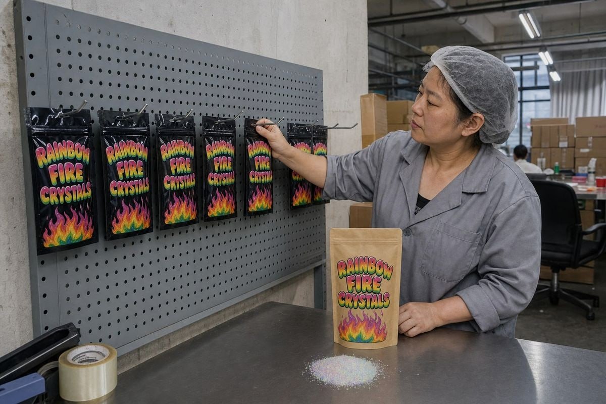
Designing a hang-tab package for Magic Fire Powder sounds simple until torn tabs, crooked hooks, and rejected safety labels start costing our clients real shelf space and sales.
A hang-tab package for Magic Fire Powder needs a Euro-slot or Delta-style tab centered on the pack's weight, tear-resistant reinforced material, compliant flame-safety labeling that stays unobstructed, and vibrant print with a moisture-resistant barrier so colors and structure survive months on pegboard hooks.
Let me walk you through each decision, from tab shape to print finish, using what we have learned putting flame colorant packets on retail hooks in 30+ countries.
What size and shape should I choose for a hang-tab that fits standard pegboard hooks?
A buyer in Poland once returned a full trial batch to us because the packets sagged sideways on his hooks rotogravure 1. That single detail nearly killed the retail program before launch.
Choose a Euro-slot (Euro hole punch) or Delta-style hang tab sized for standard 1/4-inch pegboard hooks. Center the slot over the pack's center of gravity, leave at least 10mm of reinforced material around the hole, and keep total pack width within planogram clearance of 1/8 to 1/4 inch.

The tab shape decides how your pack behaves on the hook OEM/ODM capability 2. In our experience, a Euro hole punch is the safest default. Its wide horizontal slot lets the packet self-center on almost any standard hook, including double-prong scan hooks. A Delta (triangle) slot also self-centers, and it resists tearing slightly better because the load spreads along two angled edges instead of one flat top edge.
A simple round hole is the weakest choice. The packet slides along the hook, tilts, and looks messy after a few customer touches. On a crowded point of purchase display 3, crooked packets read as cheap products.
Match the tab to your pack format
Our Magic Fire flame colorant packets ship in foil pouches, kraft bags, and boxed sachets. Each format hangs differently:
| Pack format | Best hang-tab type | Reinforcement needed | Typical weight it must hold |
|---|---|---|---|
| Foil pouch (25–30g) | Euro slot punched in heat-seal area | Extra-wide top seal (12mm+) | Light; low tear risk |
| Kraft stand-up pouch | Adhesive PET hang tab | High-tack adhesive, 24–48h cure | Medium; watch delamination |
| Paperboard sleeve/box | Integrated die-cut Delta tab | Double-layer paperboard at slot | Medium; watch hole deformation |
Weight distribution matters more than weight
Powder settles at the bottom of a pouch. That pulls the center of gravity low, so the tab must sit exactly on the vertical centerline. During weight distribution testing at our Ningbo plant, we hang filled packs on a test hook, tap them, and check that they return to vertical. If the pack rotates even five degrees, we adjust the die-cut template before mass production. We also add a small stress-relief seal between the sachet body and the tab zone, so constant vertical tension never propagates a tear into the powder chamber.
How do I make sure my packaging design meets safety and compliance labeling requirements?
Compliance is the first thing serious importers ask us about, well before price. Our ISO 9001 4, BSCI, CE, and SGS/Intertek documentation exists precisely because retail buyers demand it.
Keep all mandatory warnings visible and never covered by the hang tab or hook. Include unopened-use instructions, keep-away-from-children language, storage cautions against heat and sparks, and a link or QR code to the safety data sheet. Verify wording against destination-market rules like the FHSA in the US.

Here is the tension you have to resolve honestly: more safety copy improves risk communication, but dense text kills shelf impact. Some designers argue you should minimize warnings to keep the pack pretty. We push back on that with every client. A fire-adjacent product with weak labeling gets pulled from shelves, and one recall costs far more than a slightly busier back panel. The answer is placement discipline, not deletion.
Zone your copy before designing anything
We split every dieline into three zones. The front panel carries the brand, the flame visual, and one short instruction line: "Toss unopened packet into fire." The back panel carries full instructions, warnings, storage guidance, and the barcode. The tab header zone stays clear of any mandatory text, because a metal hook passing through it would obstruct required disclosures — a direct compliance failure under rules like the Federal Hazardous Substances Act 5.
The non-negotiable copy checklist
- Do not open the packet; use it unopened in the fire.
- Keep away from children and pets.
- Store away from heat, sparks, open flame, and direct sun.
- Do not use in cooking fires or for food preparation.
- Country-specific hazard statements per your import market.
- Safety data sheet 6 compliance reference, ideally via a QR code that also serves marketing content like a flame-effect demo.
One more distinction we always make clear to buyers: packaging design communicates hazards; it does not change them. Our Magic Fire formulas use eco-friendly materials with no harmful chemicals, and we back that with test reports. But the label must still treat the product as a fire-use item, because that is how regulators and retailers will judge it.
What printing and material options will keep my colors vibrant on retail shelves?
Trade-offs come up constantly in material selection. A German fireplace distributor once asked us for the cheapest film available; we showed him two packs after simulated shelf aging, and he changed his order the same day.
Use rotogravure or high-resolution digital printing on metallized PET or foil laminate with a gloss or matte overlaminate. Add UV-resistant inks and adhesives, plus a moisture-resistant barrier layer, so rainbow gradients stay vivid and the hygroscopic powder stays dry through the full retail season.

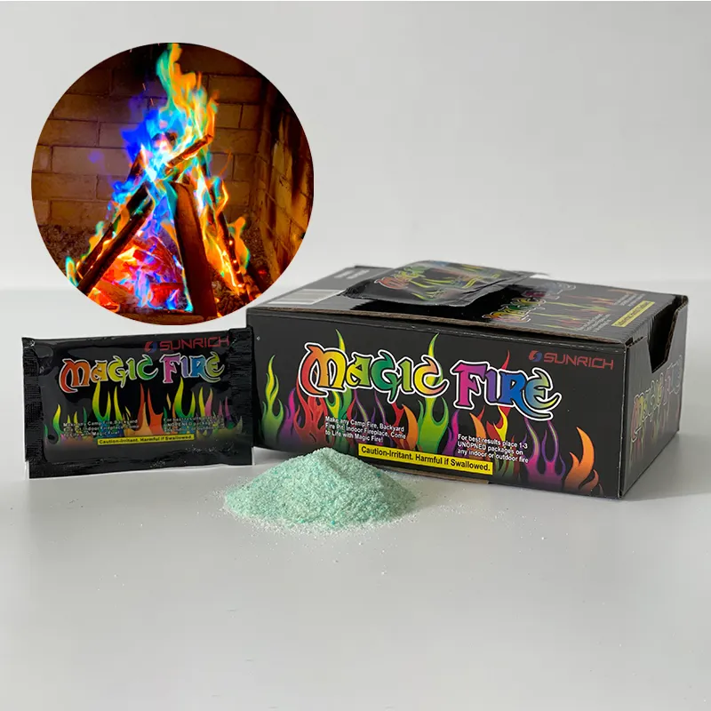
Our Magic Fire packs live or die on that rainbow-gradient flame graphic against glossy black. That visual is what triggers impulse buy merchandising in a camping aisle. If the ink fades, the whole "magic" promise collapses on the shelf.
Material comparison for hang-tab packs
| Material | Color vibrancy | Moisture protection | Tear resistance at tab | Best use case |
|---|---|---|---|---|
| Metallized PET laminate 7 | Excellent (deep blacks, bright gradients) | Excellent | Good with wide seals | Premium foil pouch |
| Kraft/PE laminate | Good (natural, matte look) | Good | Medium; needs adhesive tab | Eco-positioned secondary pouch |
| Coated paperboard sleeve | Very good with coating | Needs inner pouch | Excellent if double-layered | Giftable boxed sachet |
| Plain PE film | Fair | Poor | Poor | Not recommended for pegboard |
Three technical details buyers often miss
First, moisture. Flame-coloring salts are hygroscopic. Without a proper moisture-resistant barrier, the powder clumps, the pouch bloats, and the pack weight shifts — which then stresses the hang tab. Barrier film is not a luxury here; it protects both product and structure.
Second, UV and heat exposure. Seasonal fire products often sit in sun-exposed garden centers or warm outdoor retail sections. We specify UV-resistant inks and high-tack, UV-stable adhesives on adhesive hang tabs, and we apply those tabs at controlled room temperature with a 24-to-48-hour cure before packing cartons.
Third, batch consistency. Vibrancy means nothing if carton two looks different from carton twenty. Our lines run strict batch-to-batch color checks against approved proofs, so the first sample you approve reliably matches mass production.
Can I get custom hang-tab packaging designed for my brand at a low minimum order quantity?
Trial orders are where most of our long-term partnerships begin. A UK camping brand started with a modest first run of private-label packets; three seasons later, they order full container loads.
Yes. A genuine factory with in-house OEM/ODM capability can deliver custom hang-tab packaging — your logo, colors, tab style, warning labels, and barcodes — at low trial MOQs. Digital printing and shared die-cut templates keep setup costs down while you validate the product at retail.

The honest answer depends on who you buy from. Trading companies stack margins and push high MOQs because they cannot control the print line. A real factory can flex. At our facilities in Liuyang and Ningbo, we run 17+ years of complete production lines, which lets us slot small trial runs between larger jobs without exotic pricing.
How the low-MOQ workflow runs
- You send your brand assets and target market. We confirm labeling rules for that market first, not last.
- We propose a die-cut template from our proven hang-tab library — Euro slot for pouches, Delta tab for sleeves — so you skip custom tooling on the first run.
- Our team builds the dieline with your artwork, header card design, warnings, and barcode placement, then sends a 3D mockup showing the pack hanging at realistic peg height.
- We print a physical sample, run hook-hang and drop checks, and ship it to you for approval.
- Production starts only after your signed-off sample, and every batch is checked against it.
What customization actually covers
| Element | Customizable? | Typical trial approach |
|---|---|---|
| Pack size and fill weight | Yes | Standard 25g sachet to start |
| Tab shape and position | Yes | Library die-cut template |
| Brand artwork and colors | Fully | Digital print, no plate cost |
| Warning labels and languages | Yes | Market-specific templates |
| Barcodes and QR codes | Yes | Buyer-supplied or generated |
| Retail-ready packaging (display cartons) | Yes | Counter display or clip strip |
Some buyers worry that low MOQ means secondary-quality output. In our case it does not, because trial runs use the same certified materials, the same lines, and the same QC gates as full production. That is the entire point of testing small before scaling.
Conclusion
A great hang-tab package balances retail the



 English
  Spanish
  German
  French
  Arabic
  Portuguese
Join the Conversation