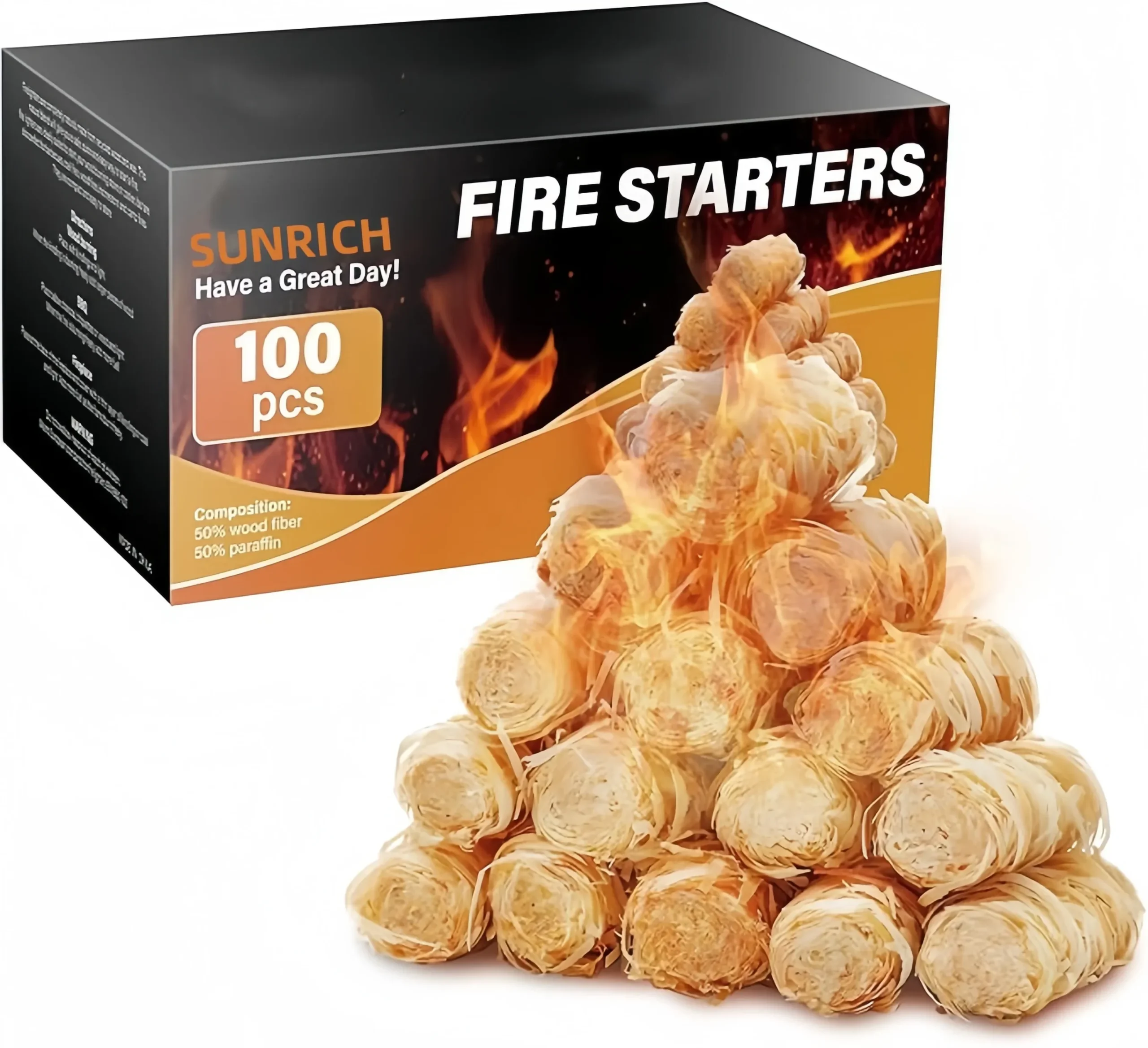
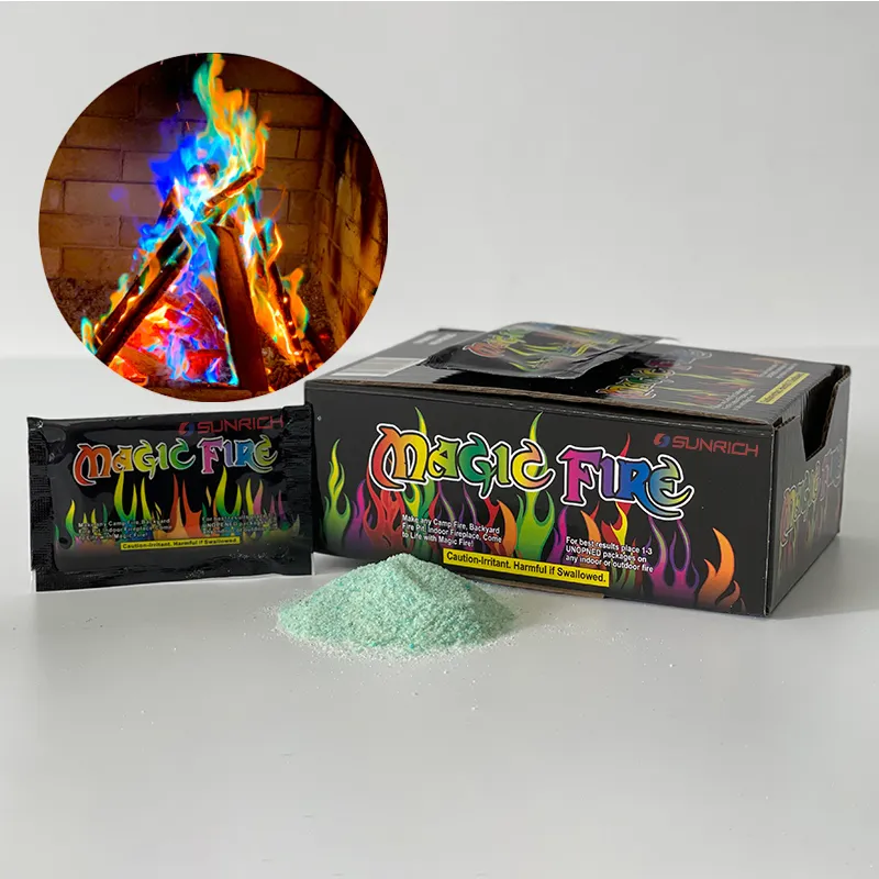
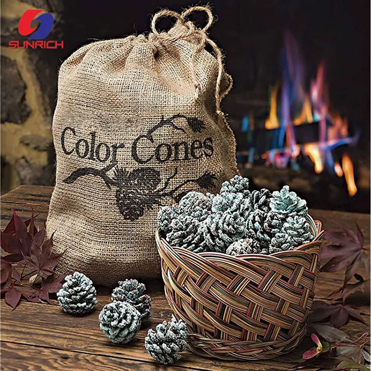
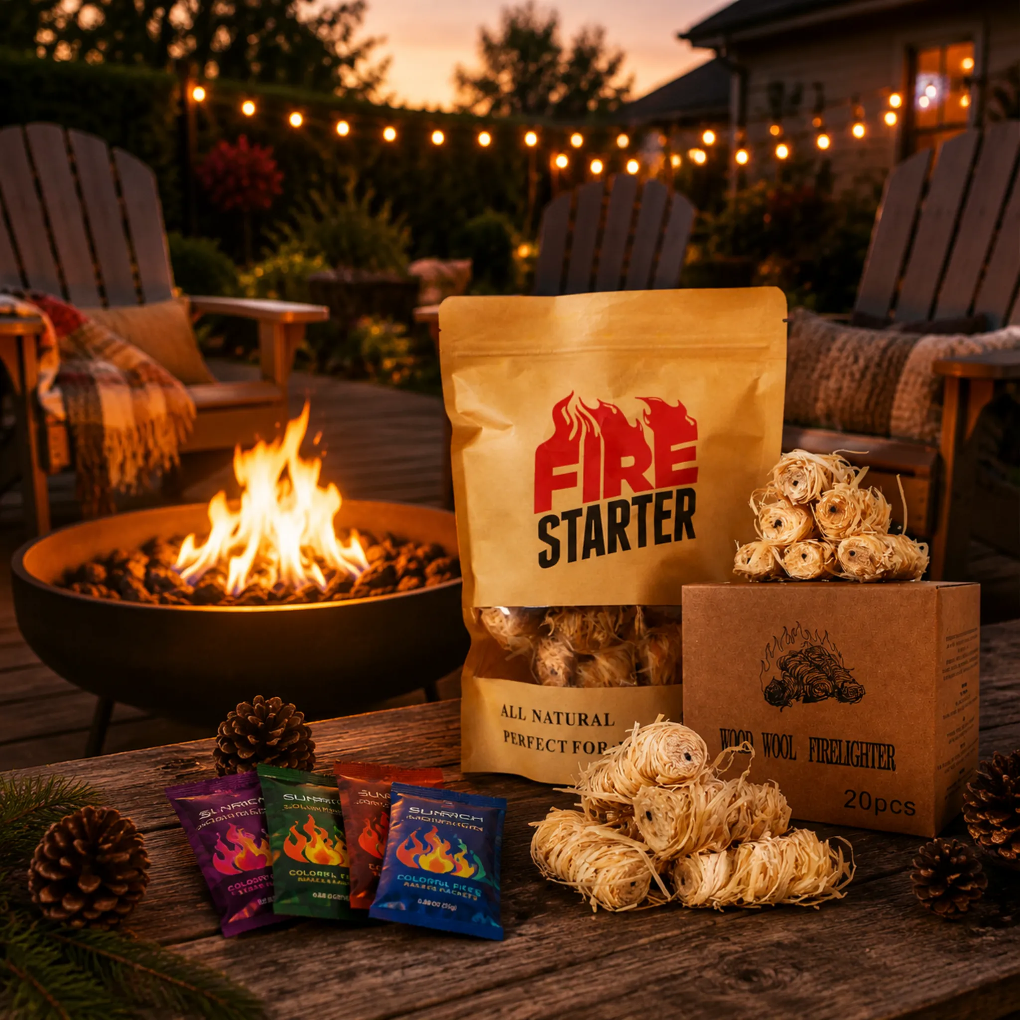
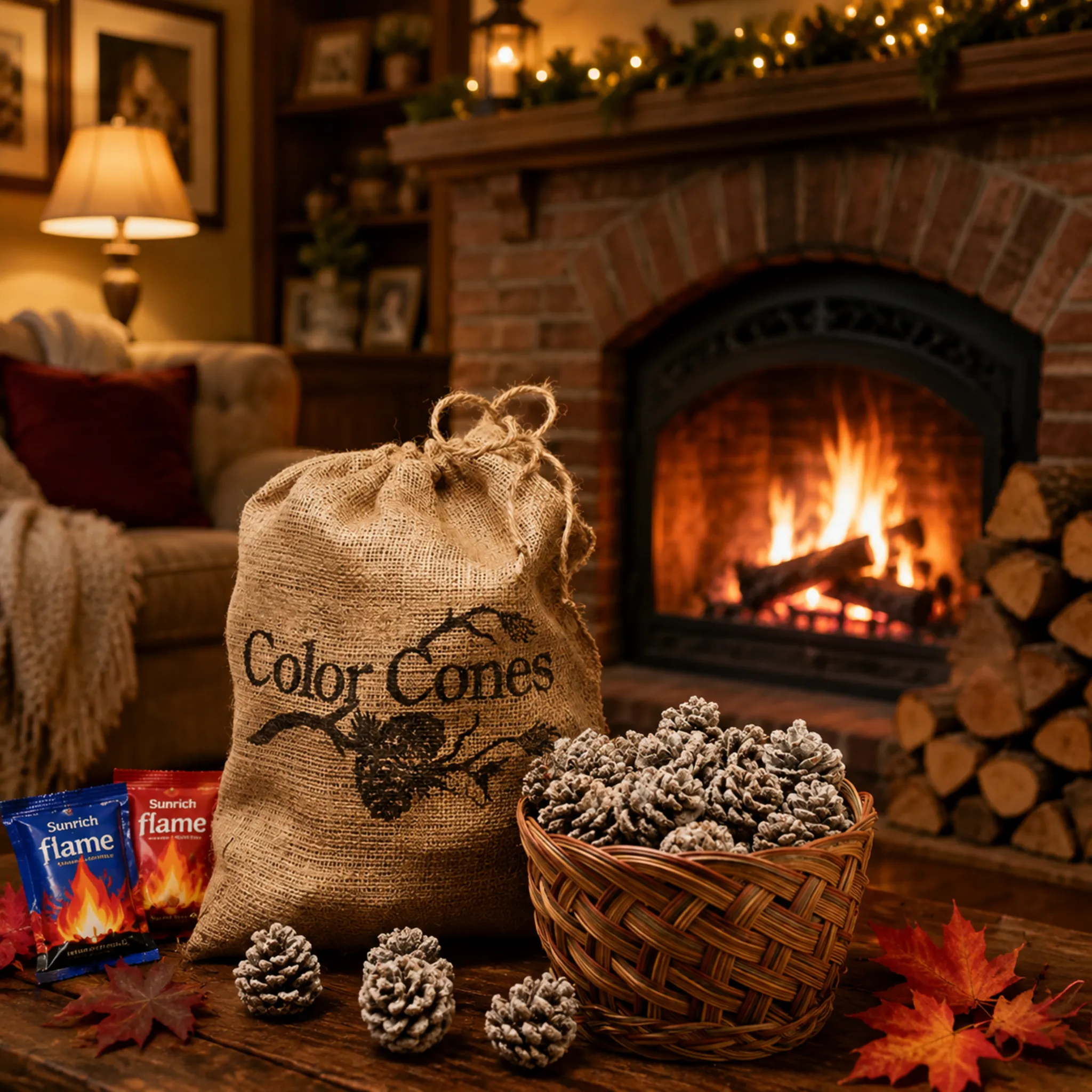
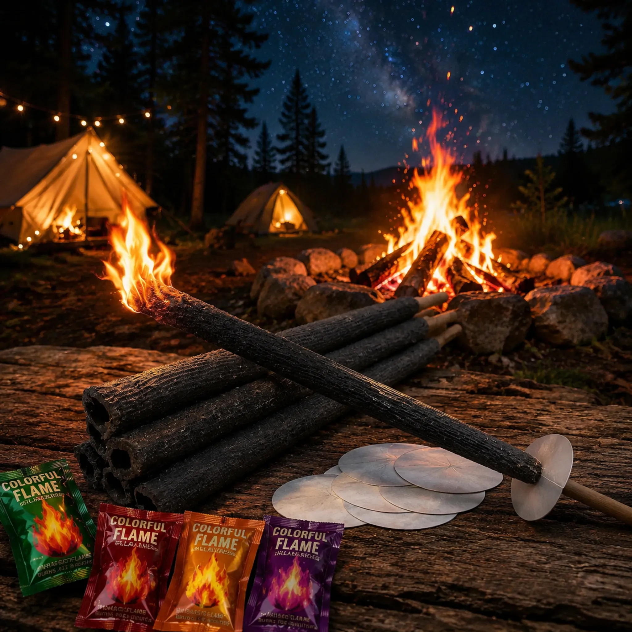

L'emballage des pommes de pin colorées pour cheminée peut faire ou défaire un lancement en magasin chlorure de strontium 1. J'ai vu d'excellents produits mourir sur les étagères parce que nos premiers acheteurs sous-estimaient ce regard de première seconde.
Sur l'emballage des pommes de pin colorées pour cheminée, les consommateurs remarquent d'abord le nom du produit, puis l'indice visuel le plus frappant — généralement une image de flamme multicolore ou une fenêtre montrant les pommes de pin. Les affirmations sur les avantages comme "flammes colorées" viennent ensuite, tandis que le temps de combustion, les avertissements de sécurité et le nombre de pommes de pin sont enregistrés en dernier.
Cette commande est plus importante que la plupart des acheteurs ne le pensent ISO 9001 2. Ci-dessous, je détaille chaque couche du panneau avant, afin que vous puissiez prioriser ce qui se vend réellement.
Quels éléments de conception d'emballage font ressortir mes pommes de pin colorées sur les étagères de vente au détail ?
Un distributeur en Pologne nous a une fois retourné un lot d'essai, non pas parce que les cônes étaient défectueux, mais parce que son simple sac en papier kraft "ressemblait à de la nourriture pour animaux" à côté de ceux des concurrents. Certifications BSCI 3. Notre équipe d'emballage l'a repensé en deux semaines.
Les éléments qui font ressortir les pommes de pin colorées sont un nom de produit audacieux en contraste élevé, un graphique flamme arc-en-ciel ou une fenêtre transparente montrant les pommes de pin, des couleurs festives saisonnières et une courte ligne de bénéfice. Tout le reste appartient au panneau arrière.

Les acheteurs ne lisent pas les emballages. Ils les scannent. La recherche sur le suivi oculaire des emballages 4 montre systématiquement que le nom du produit est parmi les éléments les plus remarqués, tandis que la quantité et les petits caractères sont rarement vus en premier. Votre panneau avant a environ trois à cinq secondes pour répondre à une question : "Qu'est-ce que c'est ?" Si la réponse n'est pas claire, le cerveau de l'acheteur désélectionne votre produit et passe à autre chose.
La hiérarchie visuelle qui gagne le premier regard
Au cours de nos plus de dix-sept années d'approvisionnement en produits à flamme colorée, nous avons constaté qu'une hiérarchie simple fonctionne le mieux pour cette catégorie :
| Priorité | Élément | Pourquoi il attire l'attention |
|---|---|---|
| 1 | Nom du produit ("Pommes de pin à flamme colorée") | L'identité textuelle est scannée en premier lorsqu'elle est grande et centrée |
| 2 | Image de flamme arc-en-ciel ou fenêtre transparente | Une image vive retient le regard plus longtemps que le texte |
| 3 | Une ligne d'avantage ("Transformez votre feu en arc-en-ciel") | Confirme le but en une seule lecture |
| 4 | Nombre de pommes de pin et durée de combustion | Pratique, mais remarqué plus tard |
| 5 | Avertissements, certifications, instructions | Essentiel, mais matériel du panneau arrière |
Gardez le panneau avant à trois priorités
Il y a une réelle tension ici. Les acheteurs veulent souvent y mettre des allégations de durabilité, des divulgations minérales, des notes de parfum et du texte de sécurité sur le devant. Résistez à cette envie. Un panneau encombré dilue chaque élément qu'il contient. Limitez le devant à la marque, au nom et à un visuel dominant. Lorsque nous réalisons des projets de marque privée pour des distributeurs américains et allemands, les emballages qui se récommandent le plus rapidement sont presque toujours les plus simples. Poussez les Références de la fiche de données de sécurité 5, les listes d'ingrédients et le texte réglementaire à l'arrière, où les lecteurs attentifs les trouveront une fois que le produit sera déjà entre leurs mains.
Dans quelle mesure les visuels à effet de flamme colorée devraient-ils dominer mes illustrations d'emballage ?
Voici un compromis que nous évaluons sur presque toutes les briefs d'art OEM : les flammes colorées sont invisibles à l'intérieur du sac, pourtant elles sont la seule raison pour laquelle quelqu'un achète. Alors, quelle place devrait avoir l'effet ?
Les visuels de flamme colorée devraient occuper environ 40 à 60 % du panneau avant, suffisamment pour communiquer instantanément l'effet de flamme bleue, verte et violette, tout en laissant un espace clair pour le nom du produit. Soutenez l'image avec un code QR renvoyant vers une vidéo de démonstration de flamme réelle.

Le problème principal de ce produit est que sa magie est cachée. Un acheteur voit des cônes bruns simples, ou pire, un sac opaque, et doit imaginer le résultat. Votre illustration doit faire cette imagination pour eux. C'est pourquoi une scène de cheminée ou de feu de camp avec des flammes multicolores vives est le visuel le plus persuasif que vous puissiez imprimer.
Montrez l'effet, mais restez honnête
Nous conseillons à nos clients de montrer des couleurs de flammes réalistes. Si votre formule utilise sulfate de cuivre 6 pour le bleu-vert et du chlorure de strontium pour le rouge, l'illustration doit refléter ces teintes réelles. Vendre des flammes fluo en excès conduit à des critiques déçues, et les critiques remontent maintenant rapidement aux acheteurs en magasin.
Équilibrez l'imagerie avec la gestion des attentes
Deux petits éléments textuels améliorent considérablement la satisfaction du client lorsqu'ils sont placés près du visuel de la flamme :
- Durée de combustion de l'effet de couleur. La plupart des cônes colorés produisent une couleur vive pendant environ 5 à 10 minutes par cône. Indiquer cela honnêtement évite la plainte "cela n'a duré que quelques minutes".
- Nombre de cônes par sac. Un nombre, pas seulement un poids, permet aux acheteurs de calculer le coût par expérience. "12 cônes = 12 feux colorés" est un message plus fort que "500g"."
Utilisez un code QR pour vaincre l'emballage opaque
Un code QR scannable reliant à une vidéo de démonstration de dix secondes résout complètement le problème de l'effet caché. Nous avons commencé à en ajouter sur les séries de marques privées il y a quelques années, et les acheteurs au Royaume-Uni et aux Pays-Bas les demandent maintenant par défaut. La vidéo montre la transformation de la flamme mieux que n'importe quelle impression statique ne pourrait jamais le faire, et cela ne coûte rien de plus de produire l'étiquette.
Ai-je besoin d'étiquettes bilingues et d'avertissements de sécurité pour vendre sur les marchés américain et européen ?
Compliance is where trial orders either scale or stall. One of our German fireplace distributors told me bluntly during a factory audit: "Without correct warning labels and test reports, I cannot even show this to my retail buyers."
Yes. EU markets typically require labels in the local language plus mandated hazard warnings, while US retailers expect English warnings and often Spanish. Both markets demand "wood-burning fires only" notices, and major buyers require Safety Data Sheets and heavy metal testing documentation.
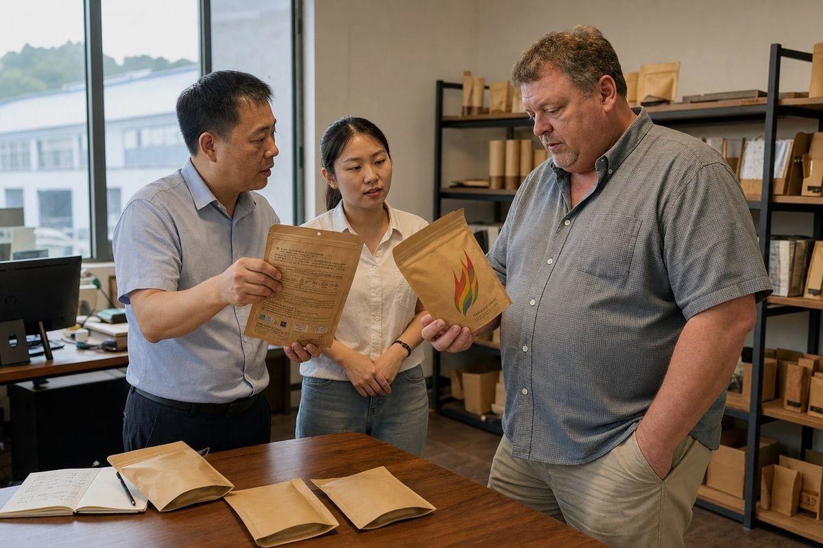
Safety text will rarely catch a consumer's eye first—and that is fine. But it absolutely catches the eye of the purchasing manager and the customs officer, and those are the eyes that decide whether your product reaches a shelf at all.
What each market actually expects
| Exigence | Marché américain | EU Markets |
|---|---|---|
| Langue | English (Spanish common) | Local language mandatory (German, French, Dutch, etc.) |
| Key warning | "For wood-burning fires only. Not for gas logs." | Same, plus CLP-style hazard pictograms where applicable |
| Documentation | Safety Data Sheet, retailer test reports | SDS, CE-relevant conformity, SGS/Intertek reports |
| Ingredient transparency | Mineral disclosure builds trust | Often expected; flame colorants must be identified |
| Indoor use claims | Must address indoor fireplace safety explicitly | Same, with ventilation guidance |
Warnings that must be high-visibility
Three warnings should never be buried in fine print, because they prevent real misuse:
- Uniquement les feux de bois. Colored cones can damage gas logs and glass-front gas fireplaces.
- Not a fire starter. The cones create color; they are not designed as a primary ignition product. We make separate wax-dipped wood firestarters for that job.
- Ne cuisinez pas sur des flammes colorées. The metal salts that create the colors are not food-safe.
From our side, every export batch ships with SDS documentation and third-party heavy metal testing results metals and your food 7. Our ISO 9001 and BSCI certifications exist precisely because US and EU chain retailers audit their supply chains. If your supplier cannot hand you these documents before you commit to a trial order, the packaging artwork is the least of your problems.
Quels formats d'emballage — sac en papier kraft, sac en plastique ou bocal — mettent le mieux en valeur mon produit auprès des acheteurs ?
Choosing a format is the first question in nearly every ODM briefing we run. Last year we produced colored pine cones in all three formats for different markets, and the sales patterns were revealing.
Les pochettes Kraft à fond plat avec une fenêtre transparente sont les plus performantes pour les étagères de vente au détail, équilibrant l'attrait rustique avec la visibilité du produit. Les sacs en toile de jute l'emportent dans le segment des cadeaux et des fêtes, tandis que les bocaux en plastique conviennent aux canaux axés sur la valeur et à gros volume. Adaptez le format à votre canal de vente, et pas seulement au coût.
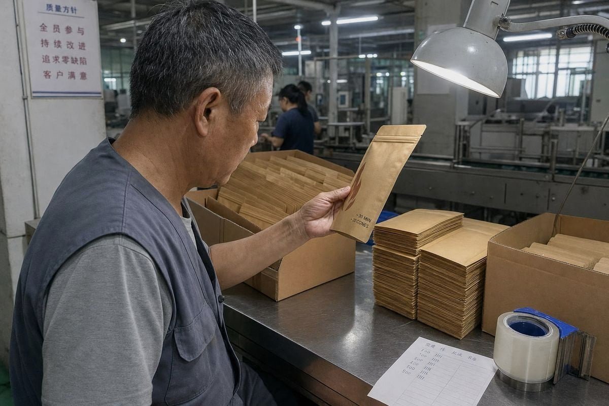
Each format sends a different signal before the shopper reads a single word. That signal should match where and why the product is being bought.
Format comparison at a glance
| Formater | Boutiques de cadeaux, jardineries, présentoirs de fêtes | Points forts | Faiblesses |
|---|---|---|---|
| Kraft pouch with window | Hardware, outdoor, camping retail | Eco-friendly look, resealable, shows real cones, prints well | Window shows uncolored cones—needs strong flame artwork |
| Burlap sack | Gift shops, holiday markets, hostess gifts | Tactile, rustic, premium feel, reinforces natural origin | Opaque; relies on hang tag and QR video; less moisture protection |
| Sac en plastique | Discount and impulse channels | Lowest cost, full artwork surface | Reads as cheap; weak sustainability signal |
| Bocal en plastique | Fireplace shops, countertop displays | Durable, reusable, cones fully visible | Heavier freight, higher unit cost |
Match materiality to your positioning
The rustic aesthetic sells in this category. Natural, hand-picked pine cones deserve packaging that looks natural too. A coarse burlap sack with jute drawstring and a printed pinecone illustration photographs beautifully next to a stone hearth—which is exactly the lifestyle image your end customer is buying. Meanwhile, a kraft pouch signals "eco-friendly craft product" to the camping crowd. We kiln-dry our cones before coloring, which keeps moisture low enough for all three formats, but we still recommend a moisture barrier liner for humid destination markets like Brazil and the Middle East.
One product, multiple formats
You do not have to pick just one. Several of our long-term buyers run a kraft pouch as their core SKU and add a burlap gift sack for Q4 only. Because our production lines handle plastic bags, kraft bags, and jars on the same colorant formulations, the incremental cost of a second format is mostly tooling and artwork—not a new product development cycle. Just remember to state whether the cones are unscented or infused with balsam or cinnamon on every format, so buyers can avoid fragrance conflicts at home.
Conclusion
Consumers notice the name and the flame visual first; everything else follows. Build a bold, honest front panel, keep compliance airtight, and choose formats that fit each channel.
Notes de bas de page
1. Reference for the mineral compound responsible for red flame color in the product. ↩︎
2. Authoritative Wikipedia entry to ensure accessibility and avoid site-wide 403 errors. ↩︎
3. Amfori BSCI is the social compliance program directly named as a supplier certification. ↩︎
4. Explains the visual scanning behavior that determines which packaging elements shoppers notice first. ↩︎
5. OSHA Hazard Communication Standard governs the Safety Data Sheet requirements mentioned. ↩︎
6. Background on the compound used to produce blue-green flame coloration in pine cones. ↩︎
7. Updated FDA directory path for the consumer guide on food metals. ↩︎



 English
  Spanish
  German
  French
  Arabic
  Portuguese
Rejoignez la conversation