
Packaging for fireplace colored pine cones can make or break a retail launch Strontiumchlorid 1. I have watched great products die on shelves because our early buyers underestimated that split-second first glance.
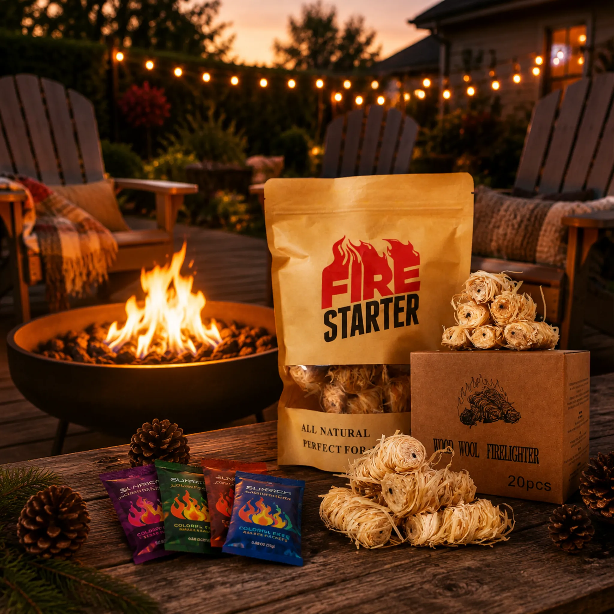
On fireplace colored pine cones packaging, consumers notice the product name first, then the most vivid visual cue—usually a multicolored flame image or a window showing the cones. Benefit claims like "colorful flames" come next, while burn time, safety warnings, and cone counts register last.
That order matters more than most buyers realize ISO 9001 2. Below, I break down each layer of the front panel, so you can prioritize what actually sells.
What packaging design elements make my colored pine cones stand out on retail shelves?
A distributor in Poland once returned a trial batch to us—not because the cones failed, but because his plain kraft bag "looked like animal feed" next to competitors BSCI-Zertifizierungen 3. Our packaging team redesigned it in two weeks.
The elements that make colored pine cones stand out are a bold product name in high contrast, a rainbow-flame graphic or clear window showing the cones, festive seasonal colors, and one short benefit line. Everything else belongs on the back panel.

Shoppers do not read packaging. They scan it. Eye-tracking research on packaging 4 consistently shows that the product name is among the most noticed elements, while quantity and fine print are rarely seen first. Your front panel has roughly three to five seconds to answer one question: "What is this?" If the answer is unclear, the shopper's brain deselects your product and moves on.
The visual hierarchy that wins the first glance
In our seventeen-plus years supplying color-flame products, we have found a simple hierarchy works best for this category:
| Priorität | Element | Why it wins attention |
|---|---|---|
| 1 | Product name ("Color Flame Pine Cones") | Text identity is scanned first when large and centered |
| 2 | Rainbow flame imagery or clear window | Vivid imagery holds the eye longer than text |
| 3 | One benefit line ("Turn your fire into a rainbow") | Confirms the purpose in one read |
| 4 | Cone count and burn time | Practical, but noticed later |
| 5 | Warnings, certifications, instructions | Essential, but back-panel material |
Keep the front panel to three priorities
There is a real tension here. Buyers often want to cram sustainability claims, mineral disclosures, scent notes, and safety text onto the front. Resist that urge. A cluttered panel dilutes every element on it. Limit the front to brand, name, and one dominant visual. When we run private-label projects for US and German distributors, the packages that reorder fastest are almost always the simplest ones. Push the Safety Data Sheet references 5, ingredient lists, and regulatory text to the back, where careful readers will find them after the product is already in their hands.
How much should color-flame effect visuals dominate my packaging artwork?
Here is a trade-off we weigh on almost every OEM artwork brief: the colored flames are invisible inside the bag, yet they are the entire reason anyone buys. So how much space should the effect get?
Color-flame visuals should occupy roughly 40–60% of the front panel—enough to instantly communicate the blue, green, and purple flame effect—while leaving clear space for the product name. Support the image with a QR code linking to a real flame demonstration video.

The core problem with this product is that its magic is hidden. A shopper sees plain brown cones—or worse, an opaque bag—and has to imagine the payoff. Your artwork must do that imagining for them. That is why a fireplace or campfire scene with vivid multicolored flames is the single most persuasive visual you can print.
Show the effect, but keep it honest
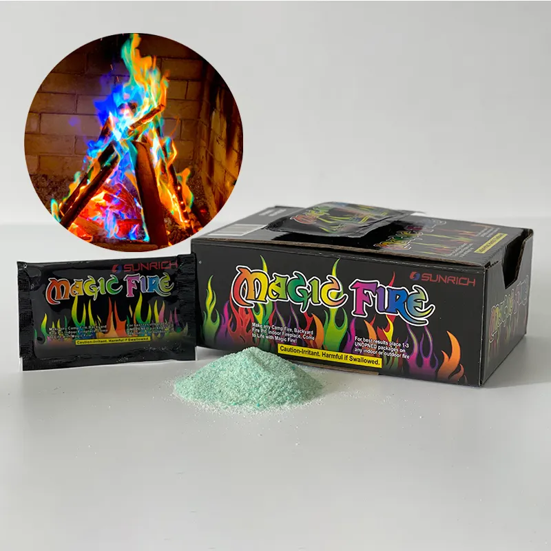
We advise our clients to show realistic flame colors. If your formula uses Kupfersulfat 6 for blue-green and strontium chloride for red, the artwork should reflect those actual hues. Overselling neon flames leads to disappointed reviews, and reviews now travel back to retail buyers fast.
Balance imagery with expectation management
Two small text elements dramatically improve customer satisfaction when placed near the flame visual:
- Burn time of the color effect. Most colored cones produce vivid color for about 5–10 minutes per cone. Stating this honestly prevents the "it only lasted a few minutes" complaint.
- Cones-per-bag count. A count, not just weight, lets shoppers calculate cost-per-experience. "12 cones = 12 colorful fires" is a stronger message than "500g."
Use a QR code to defeat opaque packaging
A scannable QR code linking to a ten-second demo video solves the hidden-effect problem completely. We started adding these on private-label runs a few years ago, and buyers in the UK and Netherlands now request them by default. The video shows the flame transformation better than any static print ever could—and it costs nothing extra to produce the label.
Do I need bilingual labels and safety warnings to sell across US and EU markets?
Compliance is where trial orders either scale or stall. One of our German fireplace distributors told me bluntly during a factory audit: "Without correct warning labels and test reports, I cannot even show this to my retail buyers."
Yes. EU markets typically require labels in the local language plus mandated hazard warnings, while US retailers expect English warnings and often Spanish. Both markets demand "wood-burning fires only" notices, and major buyers require Safety Data Sheets and heavy metal testing documentation.

Safety text will rarely catch a consumer's eye first—and that is fine. But it absolutely catches the eye of the purchasing manager and the customs officer, and those are the eyes that decide whether your product reaches a shelf at all.
What each market actually expects
| Anforderung | US-Markt | EU Markets |
|---|---|---|
| Sprache | English (Spanish common) | Local language mandatory (German, French, Dutch, etc.) |
| Key warning | "For wood-burning fires only. Not for gas logs." | Same, plus CLP-style hazard pictograms where applicable |
| Dokumentation | Safety Data Sheet, retailer test reports | SDS, CE-relevant conformity, SGS/Intertek reports |
| Ingredient transparency | Mineral disclosure builds trust | Often expected; flame colorants must be identified |
| Indoor use claims | Must address indoor fireplace safety explicitly | Same, with ventilation guidance |
Warnings that must be high-visibility
Three warnings should never be buried in fine print, because they prevent real misuse:
- Nur Holzfeuer. Colored cones can damage gas logs and glass-front gas fireplaces.
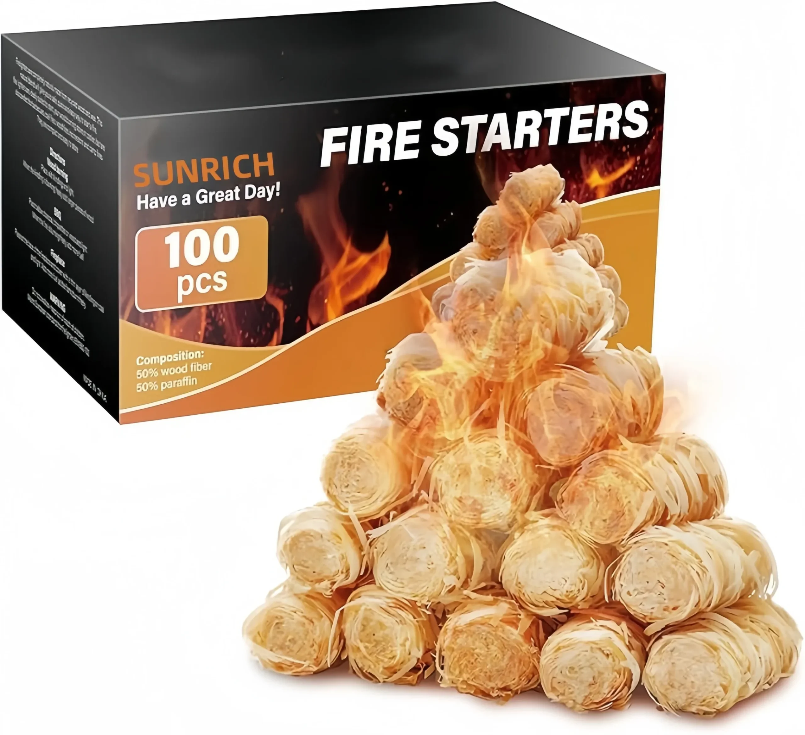
- Not a fire starter. The cones create color; they are not designed as a primary ignition product. We make separate wax-dipped wood firestarters for that job.
- Kochen Sie nicht über farbigen Flammen. The metal salts that create the colors are not food-safe.
From our side, every export batch ships with SDS documentation and third-party heavy metal testing results metals and your food 7. Our ISO 9001 and BSCI certifications exist precisely because US and EU chain retailers audit their supply chains. If your supplier cannot hand you these documents before you commit to a trial order, the packaging artwork is the least of your problems.
Which packaging formats—kraft bag, plastic bag, or jar—best showcase my product to buyers?
Choosing a format is the first question in nearly every ODM briefing we run. Last year we produced colored pine cones in all three formats for different markets, and the sales patterns were revealing.
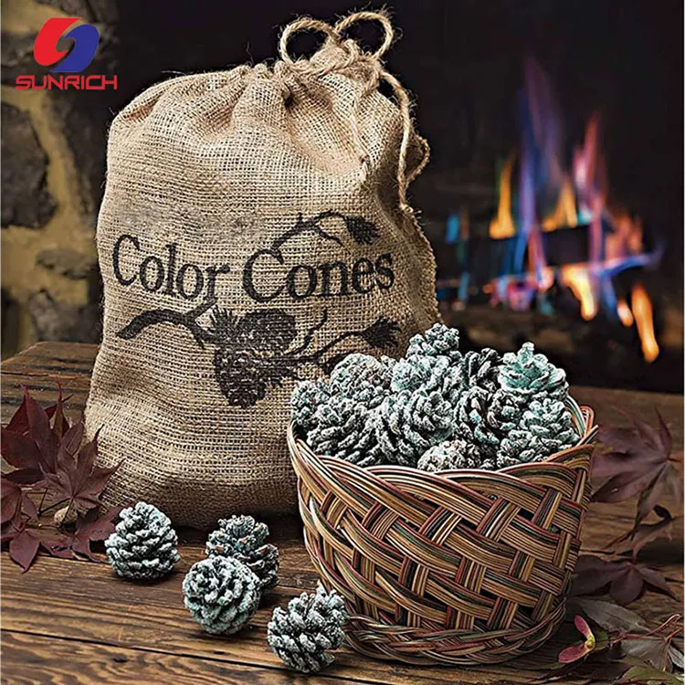
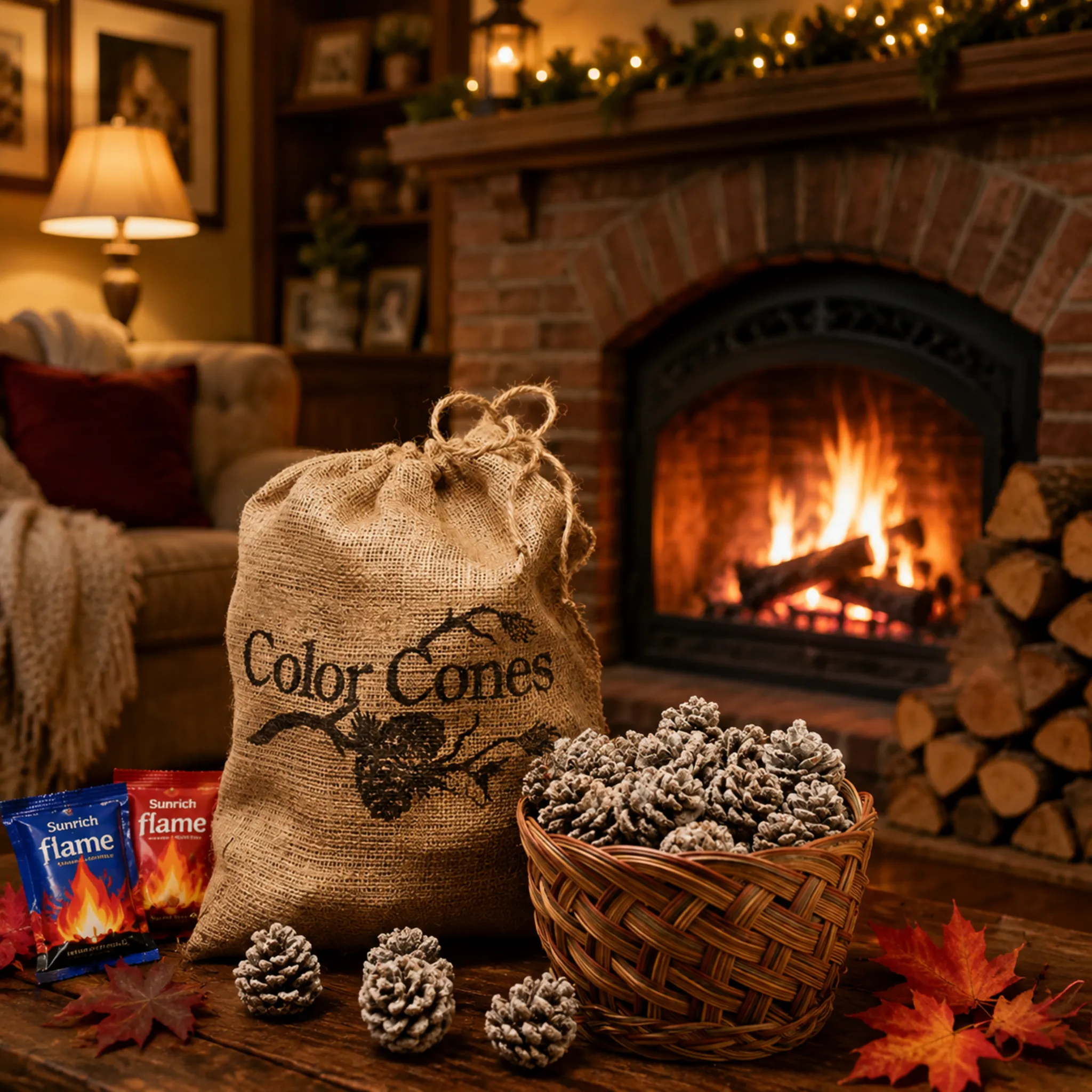
Kraft stand-up pouches with a clear window perform best for retail shelves, balancing rustic appeal with product visibility. Burlap sacks win in the gift and holiday segment, while plastic jars suit value-focused, high-volume channels. Match the format to your sales channel, not to cost alone.

Each format sends a different signal before the shopper reads a single word. That signal should match where and why the product is being bought.
Format comparison at a glance
| Format | Bester Kanal | Stärken | Weaknesses |
|---|---|---|---|
| Kraft pouch with window | Hardware, outdoor, camping retail | Eco-friendly look, resealable, shows real cones, prints well | Window shows uncolored cones—needs strong flame artwork |
| Burlap sack | Gift shops, holiday markets, hostess gifts | Tactile, rustic, premium feel, reinforces natural origin | Opaque; relies on hang tag and QR video; less moisture protection |
| Plastic bag | Discount and impulse channels | Lowest cost, full artwork surface | Reads as cheap; weak sustainability signal |
| Plastikglas | Fireplace shops, countertop displays | Durable, reusable, cones fully visible | Heavier freight, higher unit cost |
Match materiality to your positioning
The rustic aesthetic sells in this category. Natural, hand-picked pine cones deserve packaging that looks natural too. A coarse burlap sack with jute drawstring and a printed pinecone illustration photographs beautifully next to a stone hearth—which is exactly the lifestyle image your end customer is buying. Meanwhile, a kraft pouch signals "eco-friendly craft product" to the camping crowd. We kiln-dry our cones before coloring, which keeps moisture low enough for all three formats, but we still recommend a moisture barrier liner for humid destination markets like Brazil and the Middle East.
One product, multiple formats
You do not have to pick just one. Several of our long-term buyers run a kraft pouch as their core SKU and add a burlap gift sack for Q4 only. Because our production lines handle plastic bags, kraft bags, and jars on the same colorant formulations, the incremental cost of a second format is mostly tooling and artwork—not a new product development cycle. Just remember to state whether the cones are unscented or infused with balsam or cinnamon on every format, so buyers can avoid fragrance conflicts at home.
Schlussfolgerung
Consumers notice the name and the flame visual first; everything else follows. Build a bold, honest front panel, keep compliance airtight, and choose formats that fit each channel.
Fußnoten
1. Reference for the mineral compound responsible for red flame color in the product. ↩︎
2. Authoritative Wikipedia entry to ensure accessibility and avoid site-wide 403 errors. ↩︎
3. Amfori BSCI is the social compliance program directly named as a supplier certification. ↩︎
4. Explains the visual scanning behavior that determines which packaging elements shoppers notice first. ↩︎
5. OSHA Hazard Communication Standard governs the Safety Data Sheet requirements mentioned. ↩︎
6. Background on the compound used to produce blue-green flame coloration in pine cones. ↩︎
7. Updated FDA directory path for the consumer guide on food metals. ↩︎



 English
  Spanish
  German
  French
  Arabic
  Portuguese
Diskutieren Sie mit